Industry Craft > Art Direction

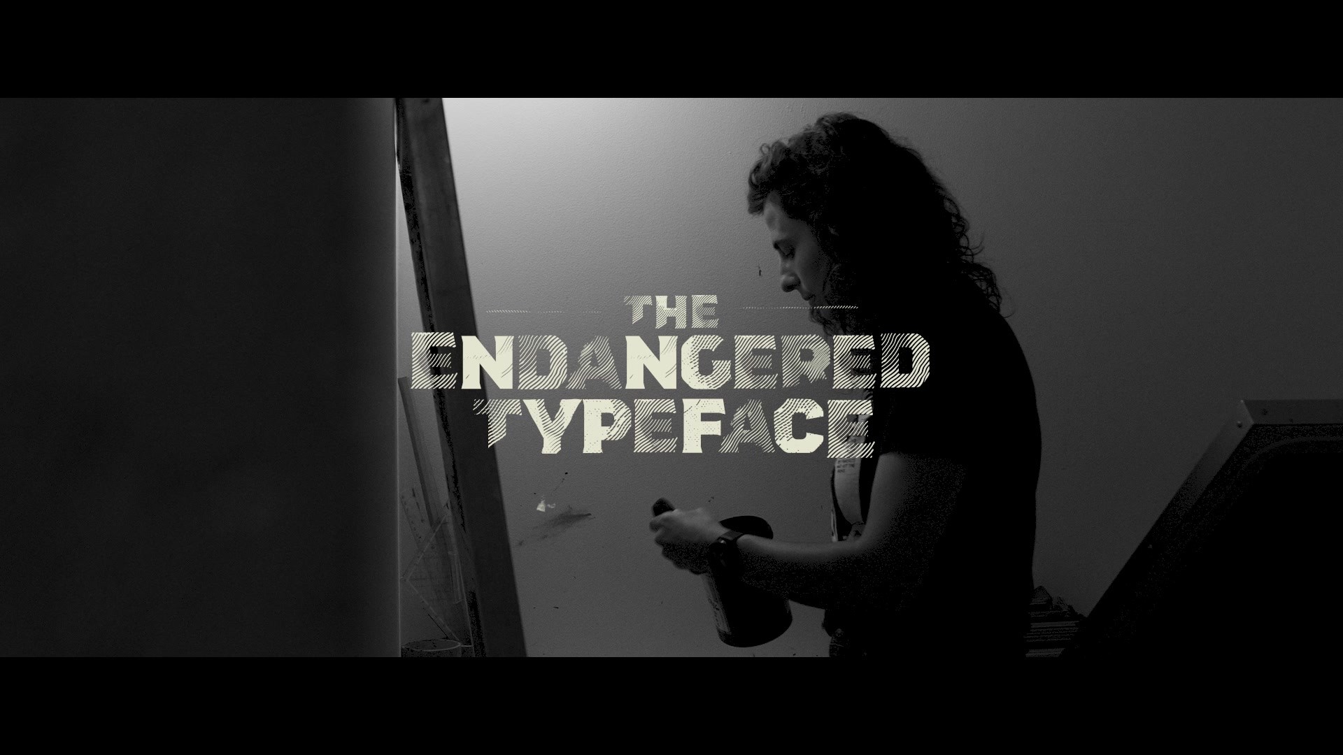
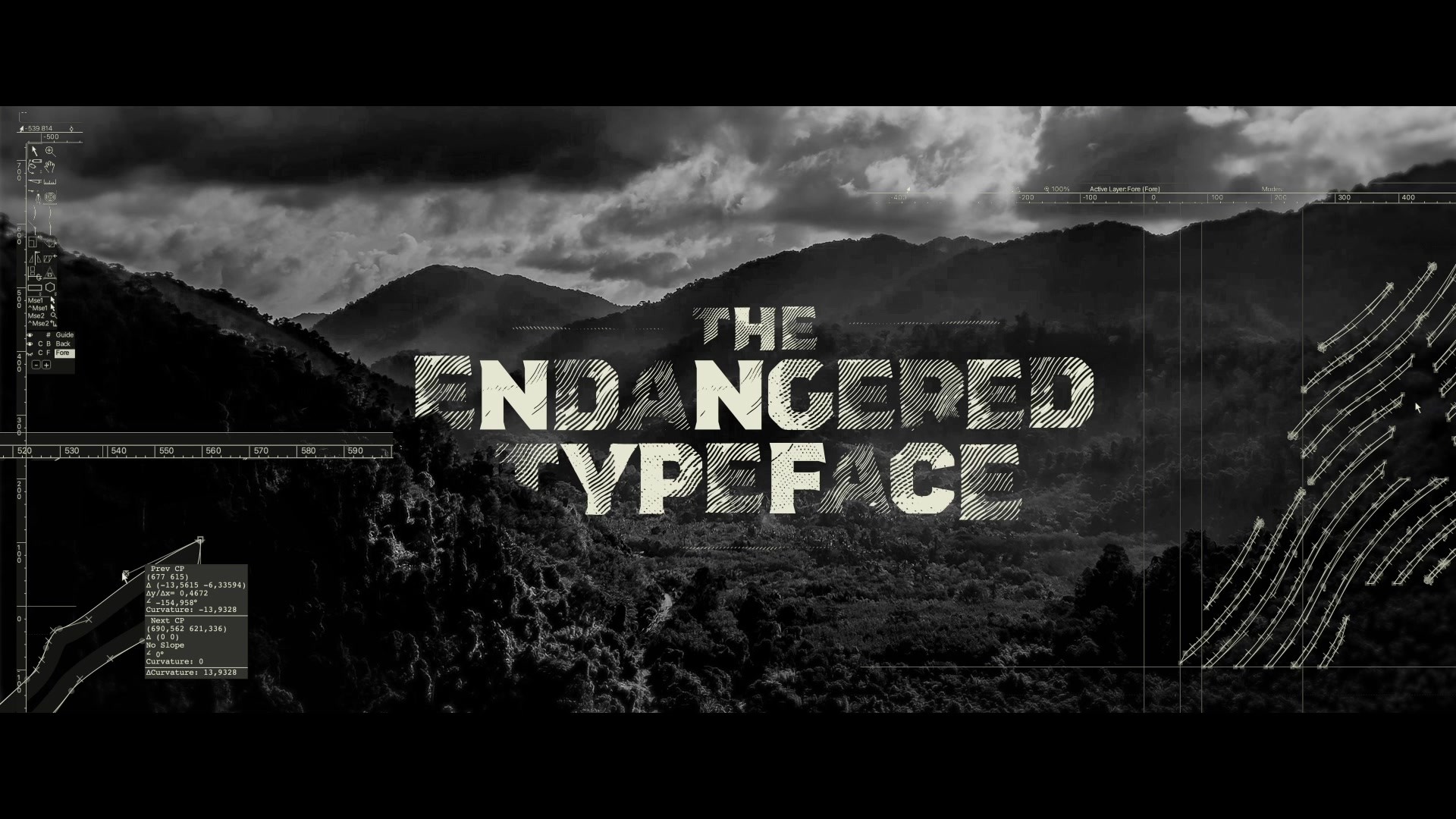
THE ENDANGERED TYPEFACE

BAR OGILVY, Lisbon / ANF|WWF & JARDIM ZOOLÓGICO DE LISBOA / 2024

CampaignCampaignLayout(opens in a new tab)
Supporting Images
Supporting Images
Supporting Content

Overview

Credits

Overview

Why is this work relevant for Industry Craft?

From 100% solid to barely visible, each of the 26 letters had to be designed one by one in 5 versions, each corresponding to one of the 5 different levels of extinction risk, from Least Concern to Endangered. As the look of the font is determined by the message it wants to transmit, it’s a genuine example of form and function aligned.

A limited edition of 26 numbered screen prints, one for each letter, was sold to support conservation projects. The number of posters for each letter is proportional to the number of remaining individuals.

Please provide any cultural context that would help the Jury understand any cultural, national or regional nuances applicable to this work.

ANP|WWF is responsible for various wildlife conservation projects in Portugal. Besides that, no cultural, national or regional nuances are applicable to this work. The extinction of species is a global problem.

Background:

Earth is facing the sixth mass extinction, which puts around 75% of species at risk of disappearing. A global threat that requires urgent action. But, despite the scale and time sensitive nature of such a massive threat, this subject is far for the spotlight and public debate. The main objective of this project was to build awareness and, with that, get society involved.

Tell the jury about the art direction.

Each of the 26 letters was individually designed in 5 versions, each corresponding to one of the 5 different levels of extinction risk: from 100% solid/Least Concern to barely visible/Endangered. Data gathered from the RED LIST determines what version of each letter is part of The Endangered Typeface at any given moment.

The font inspired the entire visual language created around it.

All design and art direction aimed to present the data in the clearest way.

The font was used across different materials to spread the message, such as videos, outdoors and social media content. Being a dynamic font, video assets were given preference to in the campaign.

A limited edition of 26 numbered screen prints, one for each letter, was sold to support conservation projects. The number of posters for each letter is proportional to the number of remaining individuals.

More Entries from Art Direction: Brand & Communications Design in Industry Craft

24 items

Grand Prix Cannes Lions
THE 100TH EDITION

Photography: Print & Publishing

THE 100TH EDITION

FRANKFURTER ALLGEMEINE ZEITUNG, SCHOLZ & FRIENDS

(opens in a new tab)

More Entries from BAR OGILVY

24 items

Gold Cannes Lions
BREAKING SIRENS

Use of Integrated Media

BREAKING SIRENS

AMNESTY INTERNATIONAL, BAR OGILVY

(opens in a new tab)