Design > Brand Building
GROWING UPTEMPO
LANDOR, Milan / ORCHESTRA SINFONICA DI MILANO / 2024
Awards:
Overview
Credits
OVERVIEW
Why is this work relevant for Design?
The design language for Orchestra Sinfonica di Milano is rooted in Milanese Futurism and epitomizes the very essence of music. Each visual element, from graphic signs to intricate glyphs, orchestrates a symphony of creativity. Breathing life into the otherwise intangible. Seamlessly blending heritage with innovation. Infusing the spirit of Milan into every aspect and creating an immersive and inclusive experience that’s resonant.
Is this product available for purchase?
The Orchestra Sinfonica di Milano consistently offers a range of events for the public, from concerts, conferences, symphonic music to educational activities for children. In 2024 there have already been 68 events. Tickets, usually priced at €40, directly support the Foundation's initiatives, including the esteemed Mahler Music Festival.
Please provide any cultural context that would help the Jury understand any cultural, national or regional nuances applicable to this work.
The Orchestra Sinfonica Foundation is one of the most important symphonic realities of Milan and Italy. Its "home" is the Auditorium of Milan. Opened in October 1999, it has a capacity of 1253 seats. In a few years, it has established itself as one of the main cultural centers of the territory. The hall is designed as a multifunctional space for concerts of symphonic, choral and chamber music, jazz and light music. The Orchestra Sinfonica Foundation promotes and spreads expressions of culture and art, with particular focus on music, symphonic, concert, lyric or otherwise musical performance, in Milan and in the Lombardy Region. Since its aim is to educate the public to music, the Orchestra has gradually assumed the function of Ambassador in Italy and abroad of the cultural values expressed: dynamism, openness to borders and internationalization. To reach its goals, the Orchestra needed a new dynamic, flexible, and innovative approach to an increasingly wide public and transversal repertoire, which is well suited to the economic and social cultural role that the city of Milan has, in Italy and abroad.
Background
Since 1993, the Orchestra Sinfonica di Milano has become an essential reference for the great Milanese symphonic repertoire and included exceptional events and prestigious halls.
Its former name was "La Verdi", heritage of the repertoire of the composer Giuseppe Verdi. This name and identity no longer indicated who they are - a great orchestra - what they do - symphonic music - and where they came from - Milan. "La Verdi" did not respond to the need to be inclusive and accessible to everyone, from insiders to beginners, from individuals to families.
Within the 10k assigned budget, the task was to create a universal identity, strongly inclusive and representing different audiences. An identity that conveys an emotional but contemporary look&feel, a key to communication that opens to an international environment, and to welcome the audience of young people and families. An effective design system, easy to apply in all touchpoints.
Describe the creative idea
The transformation of La Verdi into Orchestra Sinfonica di Milano begins opening to an international public to become a cultural point of reference with its own recognisable identity.
Not just a simple rebranding: we had to build a "bridge" capable of transcending boundaries and captivating all generations. We started from the Orchestra's hometown, Milan. A city that gave birth to Futurism — one of the most avant-garde movements celebrating dynamism as a way of life. But how to break down the barriers and make the Orchestra fully accessible?
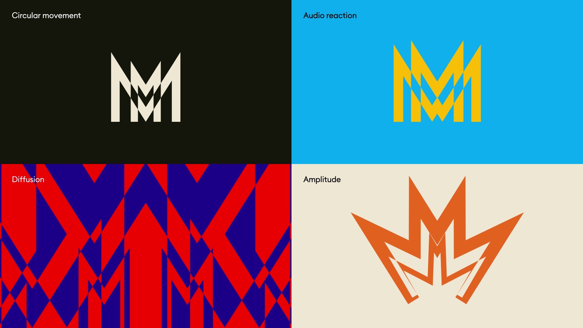
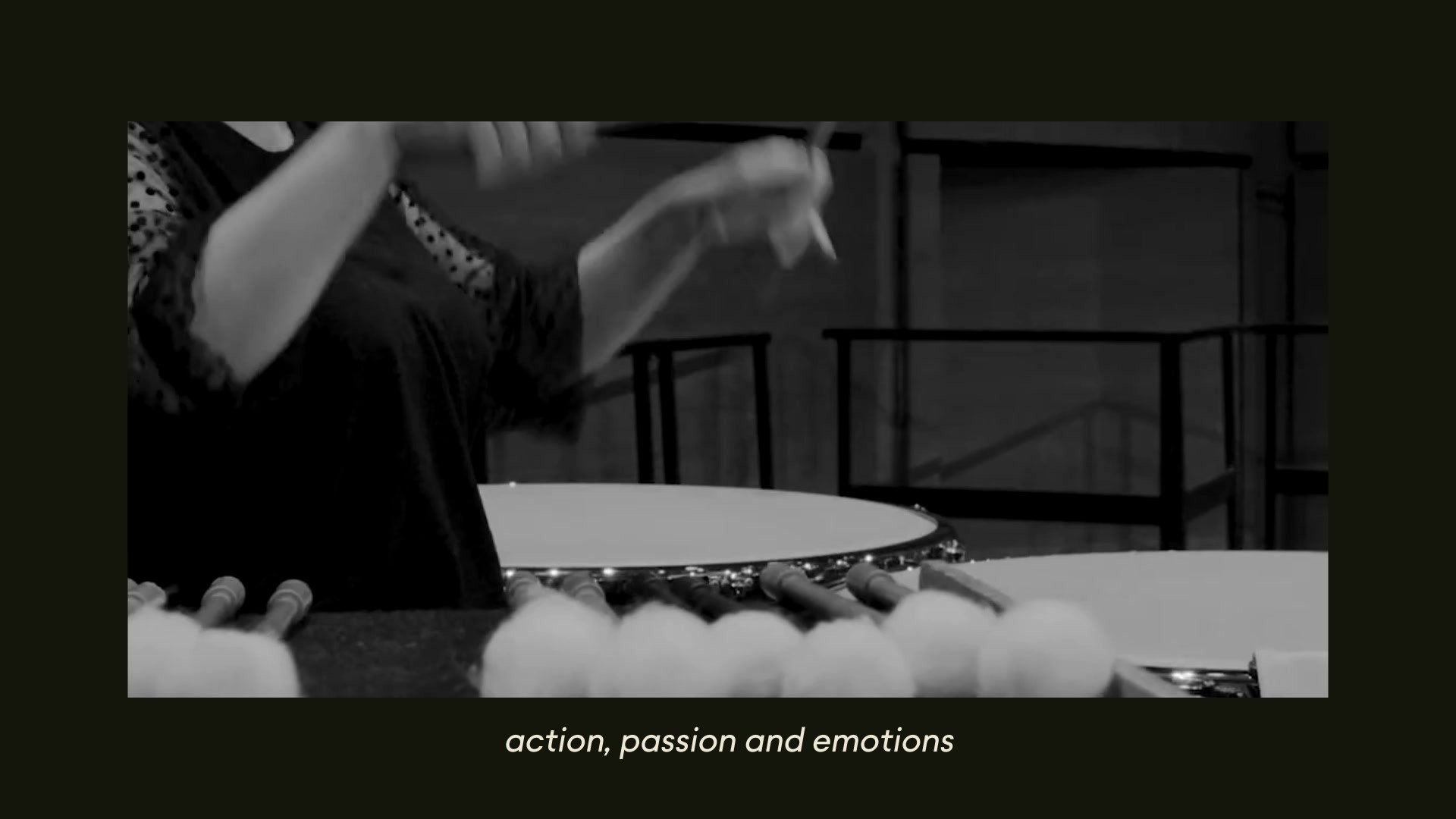
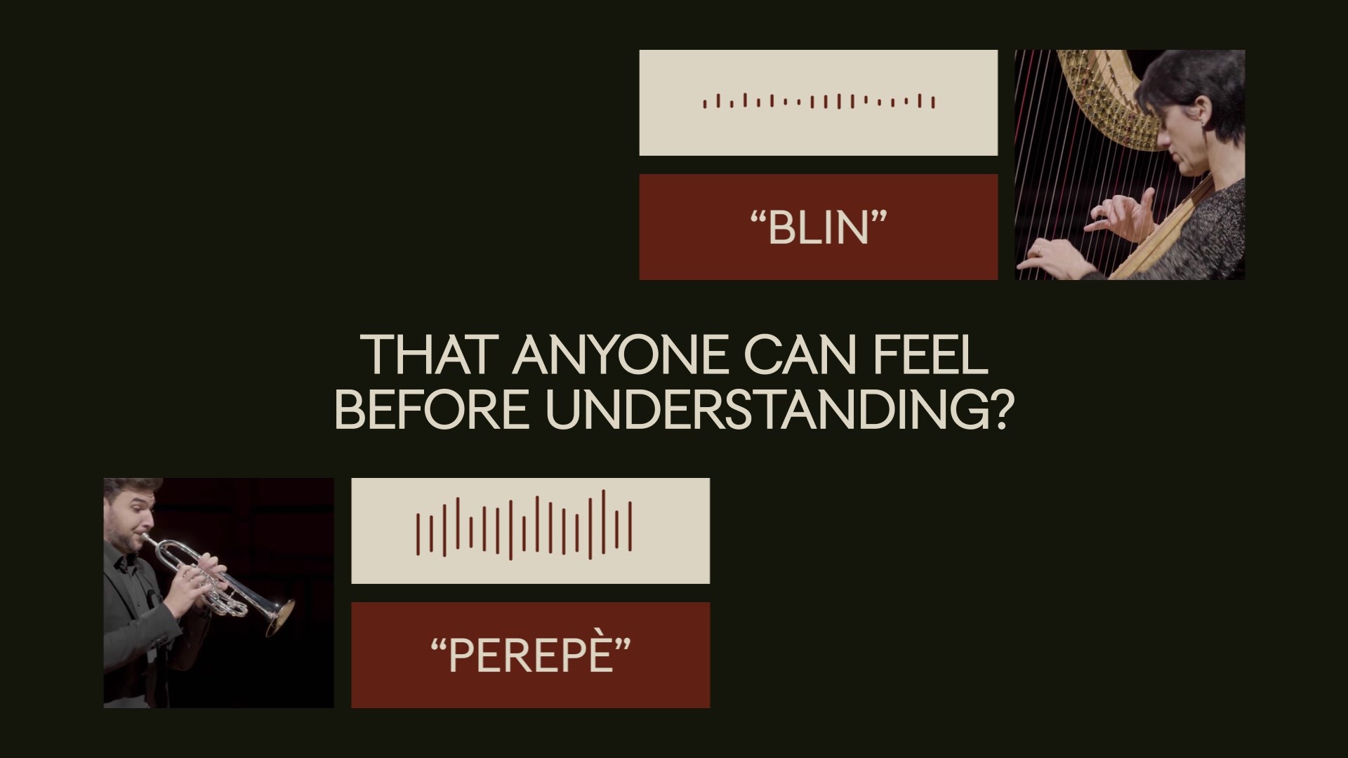
By creating a language as universal as music: that's where we took inspiration to create a visual system understandable by everyone. Studying the Futurist manifesto "Words in Freedom", which used the onomatopoeias to express sounds with words, we translated the music into "sounding visuals" that anyone can feel before understanding.
Describe the execution
We created a strategy and a visual system to represent the Orchestra’s essence and its intimate link with Milan. The design is inspired by avant-garde Milanese artform Futurism and synesthesia, the condition where you can see sounds having multi-sensorial experiences, with the potential for reactive interaction with music. The logo represents a sound wave generated from the “M” glyph that emulates the shapes of Milan’s Cathedral, the iconic symbol in the heart of Milanese people.
A coordinated image and custom typography – named TUMB TUMB - capable of playing music just like an Orchestra does, was developed in-house to add an unexpected contemporary demeanour and create a pairing between the Orchestra and the city, two evolving entities in step with the times.
List the results
The aim of enlarge the audience and to fulfill the inclusion and the disclosure of cultural multidisciplinary competences, has been reached by Orchestra Sinfonica di Milano.
After the launch of the new Identity, Orchestra Sinfonica di Milano has had a 56.9% increase in subscription sales and tickets reaching 1,309,882 euros revenues.
338,903 euros has been the peak of revenues in one month. This is the best revenue result ever reached by the sales in one month of activity, with an increase of 20.5% compared to the same period in last year and 41.3% in the previous one.
The global reach has also been successfully achieved, both regarding the invitations received to participate in international events, and in the best and most widespread dissemination of the activities’ communication, carried out by the Orchestra Sinfonica di Milano Foundation towards a wider audience, inclusive, multi-disciplined.
More Entries from Rebrand/Refresh of an Existing Brand in Design
24 items
More Entries from LANDOR
24 items