Design > Brand Building
LEAD LOUDER
COSSETTE, Montreal / THE AFRODESCENDANT LEADERSHIP ALLIANCE (ALA) / 2024
Overview
Credits
OVERVIEW
Why is this work relevant for Design?
To launch the Afrodescendant Leadership Alliance, a Canadian Black community empowerment non-profit, we created a symbol everyone could relate to and rally behind—regardless of background, language or relationship to the organization.
To do that, we started with everyday punctuation, which we customized and brought together with a simple typographic adjustment. That’s design in action—doing just enough to make it accessible to all, while also maximizing visual impact.
The result: three exclamation marks joined together as a sign of unity and self-expression. It’s simple. It’s strong. It’s universal. And it makes a statement without a single word.
Is this product available for purchase?
No
Please provide any cultural context that would help the Jury understand any cultural, national or regional nuances applicable to this work.
In Quebec and Canada, the Afrodescendant community is extremely diverse and speaks a number of different languages and dialects—often mixing them with English and French (the country’s two official languages) in conversation.
In developing the ALA platform, we saw an opportunity to reflect that kind of linguistic diversity and creativity in our messages in order to connect more meaningfully with our core target.
First, many of our copy headlines mix a word from English and a word from French, like Shine fort (Shine bright) for example. It’s something that’s never really been done before in our market, and that makes sound strategic sense in our efforts to represent and include everyone.
More importantly, the ALA logo itself is a symbol of this collective diversity and expressivity—with three exclamation marks joined together. And given the range of backgrounds of the people that the organization is targeting, it’s designed to speak to all of us without relying on one language or another.
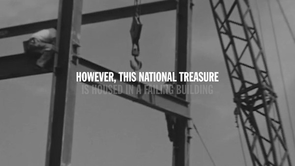
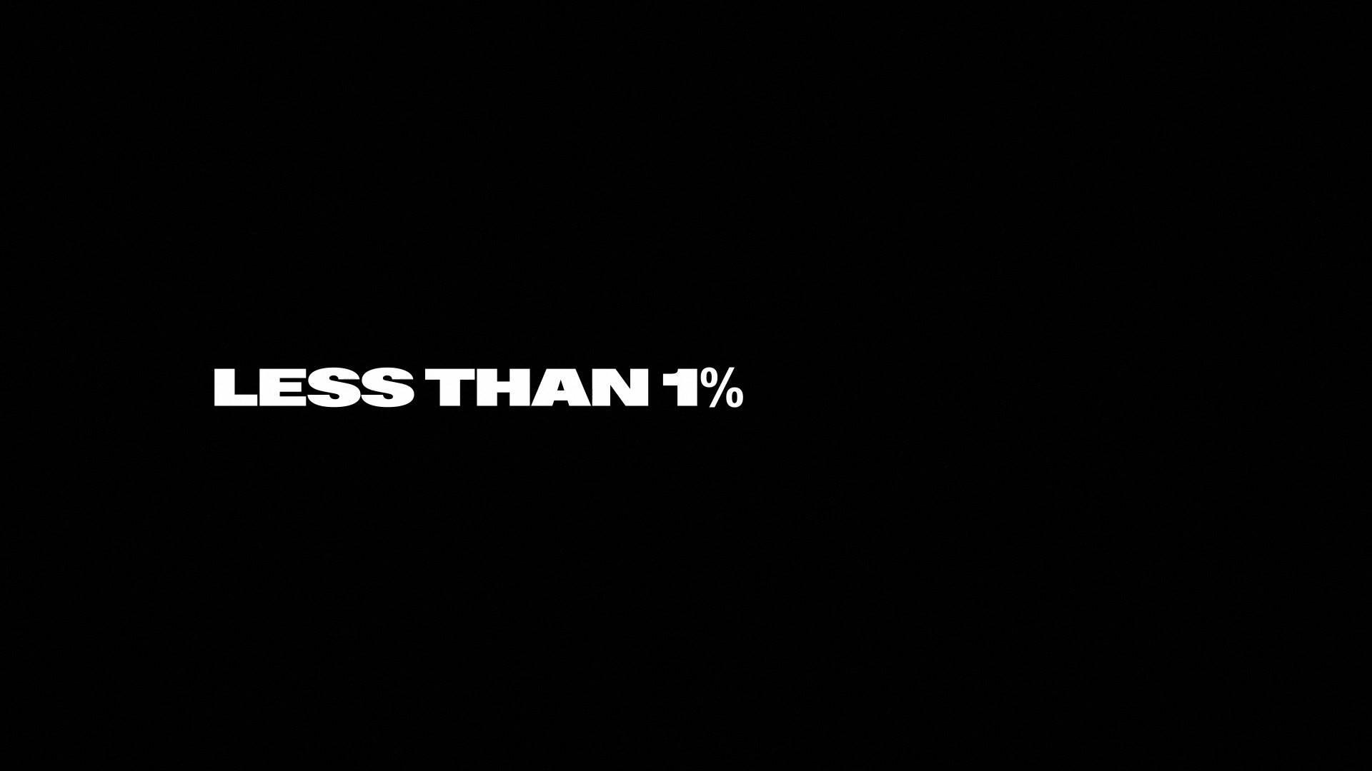
Background
In Canada, less than 1% of senior executives are Black. A study of 178 companies in Vancouver, Calgary, Montreal and Toronto reveals that only 6 of 799 senior executives and 4 of 686 board members are from the Afrodescendant community.¹ Things need to change. Now.
That’s why the Afrodescendant Leadership Alliance was formed.
With initiatives like the Black Wealth Club, Black Youth Excellence and an angel investor program, ALA exists to bring people together to create a more equitable business environment and help generate wealth for the next generation.
Thanks to the backing of founding investors like Sagard and the CDPQ (the Quebec Deposit and Investment Fund), the young non-profit organization has ambitious goals. Its launch objectives were to drive additional sponsorships and membership applications.
To do that, we needed a visual identity that’s instantly recognizable by people from all backgrounds and languages. That’s why we created a symbol.
Describe the creative idea
What inspired the design of the ALA brand is the simple truth that coming together has the power to change everything. In a world that’s still too divided, that was the spark.
And to bring it to life, we started designing from accessible everyday punctuation we all use to express emotion, importance and urgency: exclamation marks. And we customized them for impact and brought them together with a simple typographic gesture—kerning.
The result is a powerful symbol that represents the organization, the community and its allies joining forces to unite our voices and amplify our impact—and to connect us to something greater than ourselves.
It’s simple. It’s strong. It’s universal. And given the range of backgrounds and languages of the people the organization is targeting, it’s designed to speak to all of us and make a statement without needing to use a single word.
Describe the execution
The new !!! symbol is the basis for the entire visual identity.
Used as a graphic device, it adds a secondary layer of storytelling on photography. Sometimes it’s a crown on someone’s head—a powerful success signifier in many cultures. Sometimes, it’s a closed fist of strength and solidarity for the cause. And sometimes, it’s a spotlight that the organization is sharing with someone.
As a unique shape, the negative spaces within the joined exclamation marks provide structure for the grid system, creating dynamic layouts and living-brand movements.
To that were added empowering imagery of community members, a sharp black-and-white focused palette and an expressive mixed-typography approach that all reinforce the same message: with ALA, the Black community can aim higher, shine brighter and lead louder.
To support the launch, this core asset and platform were deployed across the organization’s new website, social media properties, program materials and an in-person event.
List the results
The positive thread tying the entire ALA brand together is the idea of amplification—of voices, actions and impact—something that’s unfortunately still much needed for Afrodescendant Canadians in 2023/24.
Luckily, many share that belief, as we saw at the launch. Over 300 participants showed their support by attending the event, including influential community members like Bruny Surin, Tania Clarke and Frank Baylis, and from the business world like Alexandre Taillefer, Anna Martini and Stephen Bronfman.
Our impact so far? The attention-grabbing new visual identity helped bring in $100K in sponsorships from private and public sector partners. It also encouraged 200 new applicants to sign up to learn how to create wealth and give back—in just the first 2 weeks.
Based on the early response, we’re confident that, together, we’ll move the needle on the (less than 1%) numbers of senior executives from the Black community in the country.
More Entries from Creation of a New Brand Identity in Design
24 items
More Entries from COSSETTE
24 items