Industry Craft > Art Direction
DEEZER REBRAND
KOTO, London / DEEZER / 2024
Overview
Credits
OVERVIEW
Why is this work relevant for Industry Craft?
This work is relevant to industry craft because it's an example of a top-to-bottom rebrand of one of the world's largest music streaming platforms.
Please provide any cultural context that would help the Jury understand any cultural, national or regional nuances applicable to this work.
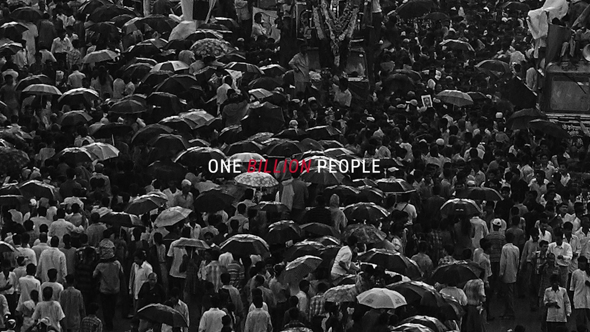
Deezer is a French company that was founded in 2007, a year earlier than Spotify. Whilst its growth over the years has been slower than the globally dominant leader, Deezer secured critical retail and telco partnerships to secure its footprint in France, gaining nearly 10 million users and scaling to 188 countries. Yet despite its first-mover advantage and existing equity in France, its perceptions had grown stagnant and the brand was viewed as less fresh and innovative than the deeply-competitive category overall.
Background:
Deezer approached the agency in need of a new identity to deliver on its evolved brand purpose, 'Deezer helps you be and belong.' Since Deezer's founding in 2007, the landscape of music streaming has exploded: growing increasingly competitive and dominated by global players with strong brands. With deep heritage in the French market, Deezer's ambition was to breathe new life into its leadership position, and to win over a Gen Z audience through a shared passion for music and a bold, quirky personality. The budget was xxx, and the scale of rebrand covered the entire global ecosystem of expression and touchpoints, including campaigns, product, content, partnerships, and more.
Tell the jury about the art direction.
To build Gen Z appeal and stand out in a crowded category, Deezer needed a fresh identity to deliver on the brand purpose, 'Deezer helps you be and belong.' Bridging into those themes of connection and expression, the agency unearthed Deezer's core belief that "music is the beating heart of life." The system is built upon the heart logo, which succinctly encapsulates the brand's essence and forms the backbone for a bold, dynamic system, particularly in motion. A custom variable typeface enriches the system across product and editorial, and a vibrant lead purple further builds distinction and equity.
More Entries from Art Direction: Brand & Communications Design in Industry Craft
24 items
More Entries from KOTO
23 items