Industry Craft > Art Direction
REPLAY REBRAND
KOTO, London / REPLAY / 2024
Overview
Credits
OVERVIEW
Why is this work relevant for Industry Craft?
The work is an example of creative thinking applied in a sector (biotech) where design has been historically overlooked. It also showcases how design can be used to bring complex scientific concepts to life, and make them tangible for a wider audience. Within this work, design is used to translate abstract scientific concepts into meaningful metaphors that a non-scientific audience can understand.
Please provide any cultural context that would help the Jury understand any cultural, national or regional nuances applicable to this work.
Replay wanted to make an impact in the biotech sector, which is typically a cold, hyper-scientific and generally unbranded space dominated by a few large players. This is particularly important when attracting both Venture funding and prospective talent.
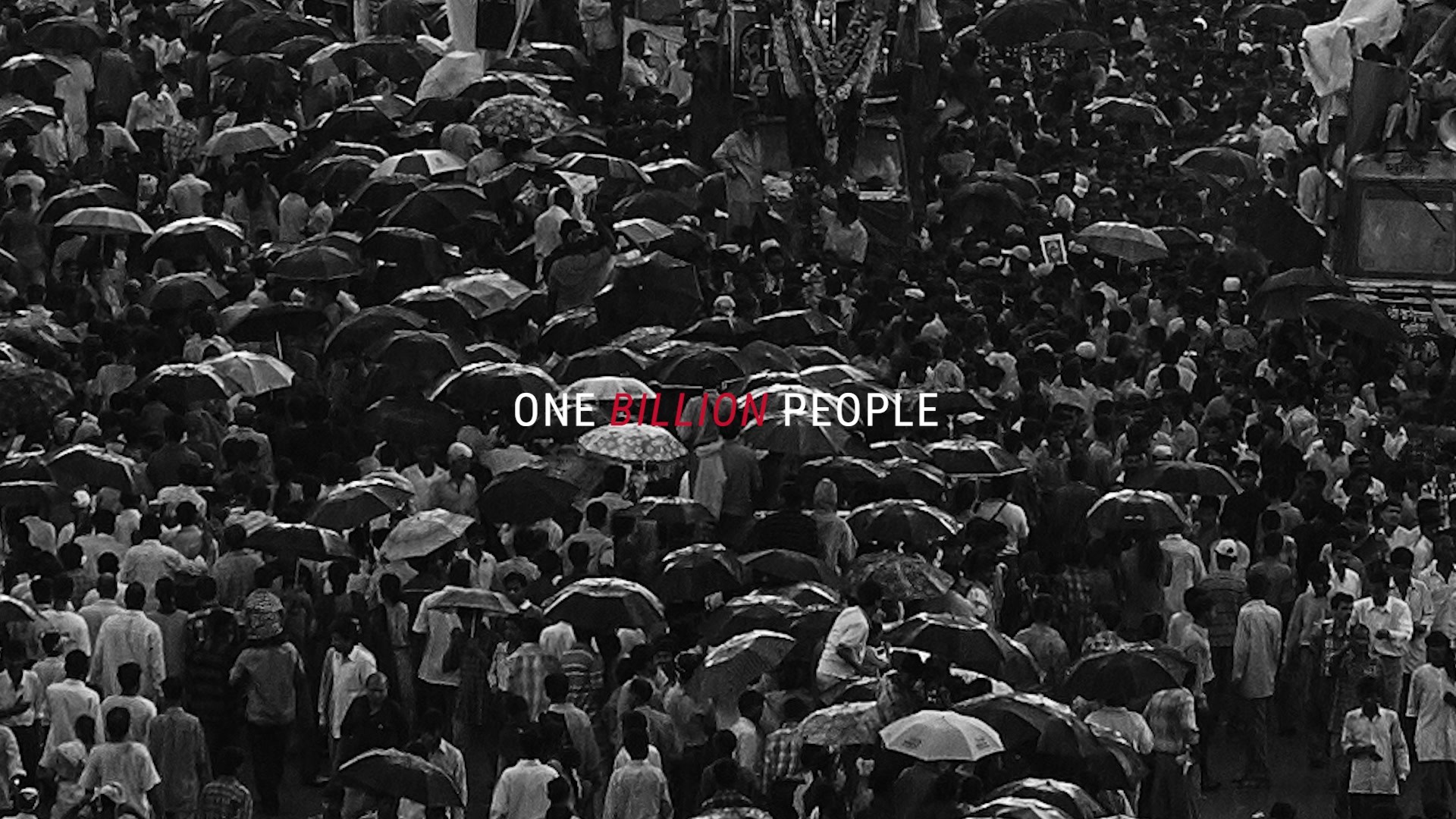
It was also necessary to underscore the real-world human impact of their work and bring a familiar sense of humanity to abstract concepts. This is particularly important given that, in the public consciousness, genome therapy is poorly understood and often feared.
Background:
Brief: A brand strategy, creative identity and website for Replay.
Objectives: Replay had been operating in start-up mode, without any visible branded elements. We were asked to define Replay’s brand strategy (vision, mission, value proposition), then develop a full visual brand identity. This included a suite of illustrations (both technical and team portraits), motion assets and a full website build.
Budget: Brand Strategy & Visual Identity — £114,000
Website Design & Build — £95,000
Tell the jury about the art direction.
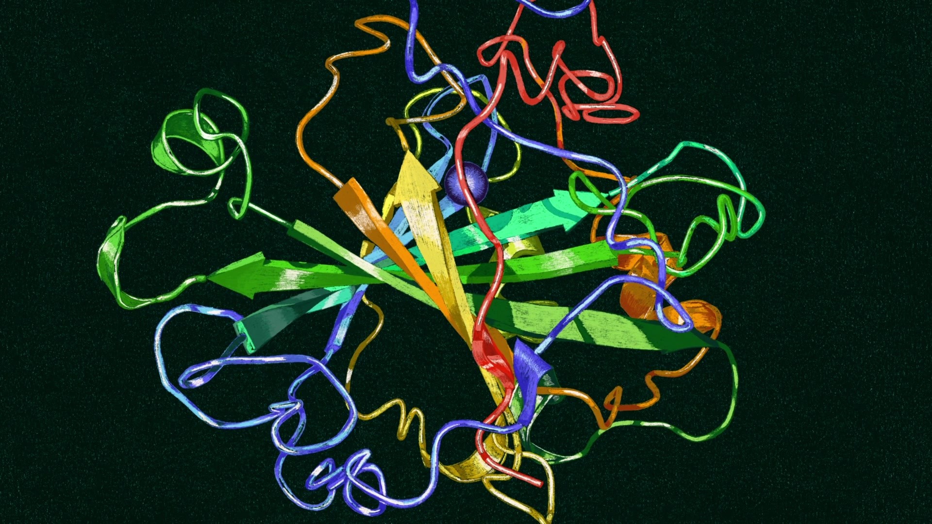
The new visual identity centers on the idea of reprogramming biology to solve life’s greatest puzzles. Firstly the logo constantly moves and regenerates, “reprogramming” itself over and over. Taking direct influence from the name ‘Replay’, it’s an infinite logo for a business with evolution at its heart. The biological, cellular forms of the logo are complemented by a softer illustration system that comes from the human hand, with a direct reference to the idea of ‘authorship’ set out in the brand’s vision. Highly detailed, beautifully coloured illustrations of cellular matter are unique in the sector. They’re further complimented by hand-drawn illustrations of the Replay team members created by illustrator Uli Knörzer. These have been animated into a set of puzzle pieces that shift but never fully resolve, in a direct reflection of the central brand idea.
More Entries from Art Direction: Brand & Communications Design in Industry Craft
24 items
More Entries from KOTO
23 items