Design > Brand Building
CALL OF DUTY
KOTO, Los Angeles / ACTIVISION / 2024

Overview
Credits
OVERVIEW
Why is this work relevant for Design?
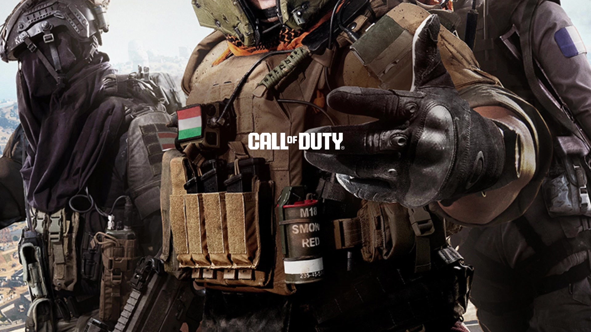
Our rebrand of Call of Duty® realigned the company to sit alongside the great entertainment brands of our time. It brought rigor and systematic thinking to an enormous 20-year-old franchise by providing a tighter arrangement of its extensive catalog of games. A custom typeface and layout system ushered in a new, modern approach to design across all touchpoints—everything from the game UI to worldwide launch marketing assets. The rebrand coincided with the launch of Modern Warfare II and Modern Warfare III, which shattered previously-held sales records, and actively held over two million concurrent players.
Is this product available for purchase?
The titles featured within this rebrand are Call of Duty® Modern Warfare III, and two free-to-play titles: Call of Duty® Warzone and Call of Duty® Warzone Mobile. Modern Warfare III and Warzone are available on Playstation, Xbox and PC consoles. Warzone Mobile is available on all mobile devices.
Please provide any cultural context that would help the Jury understand any cultural, national or regional nuances applicable to this work.
If you play games or know someone who does, you’ve definitely heard of Call of Duty®. It’s one of the world’s largest gaming franchises, with millions of concurrent players. With over 20 years of jaw-dropping moments, innovative IPs, and sweat-inducing multiplayer, Call of Duty® has not only impacted generations of gamers, but culture itself.
The world has seen a continued growth in people defining themselves as ‘gamers,’ and two of the year’s biggest hits in film and TV were adapted from gaming IP—further examples of the audience getting bigger and broader.
The Call of Duty® franchise is already a global household name, however, its age was beginning to show. A logo based on a decades-old free meme font, and constant brand reinventions year-over-year left the franchise without its own clear voice. The Call of Duty® franchise—beloved by many—found itself in a place where the opportunity to expand to a new audience was for the taking, but needed to step into a grown-up pair of boots to grab it.
Background
Facing an aging franchise and fractured brand elements, Activision asked us to unify the catalog of Call of Duty® IPs under a single, strong franchise brand. With each yearly premium title release, the Call of Duty® brand was adapted to match the content. The only consistent asset across the franchise was the logo—and that itself, has seen constant evolutions. The lack of brand hierarchy meant logo stacks were posing an issue, and coupled with a void of brand assets meant the billion dollar franchise was left without a voice.
The scale of the project was a global operation, working with the team at Activision and their internal development studios to author a brand system that worked for as many situations and future releases as possible.
Describe the creative idea
We combined contemporary design principles and a military influence to author a series of core identity components for the new Call of Duty® franchise brand. The IPs often drastically shift in tone, era, and concept which requires an all-encompassing, yet ownable, franchise brand that can stitch everything together.
We repositioned Call of Duty® as top-in-rank over the IPs and injected military vernacular with a blocky utilitarian typeface. A 'Loud and Clear' design principle took influence from military signage and decals, helping to unify the millions of brand touchpoints with a clear and concise message meant to be read at breakneck speed. The DNA of the logo was iconic to longtime players and needed to be retained, yet given a huge upgrade. These longtime players know and love the games, but in order to beckon a new era of gamers on the horizon, they needed to love the brand.
Describe the execution
The work revolved around three core elements; the logo, the typeface, and the 'Loud and Clear' design principle. The logo was redesigned to feel bold and brash, while retaining its classic footprint. Refinements were also made to improve small-scale legibility. We authored a franchise-wide lockup hierarchy system to unite the ever-expanding library of IPs with design consistency.
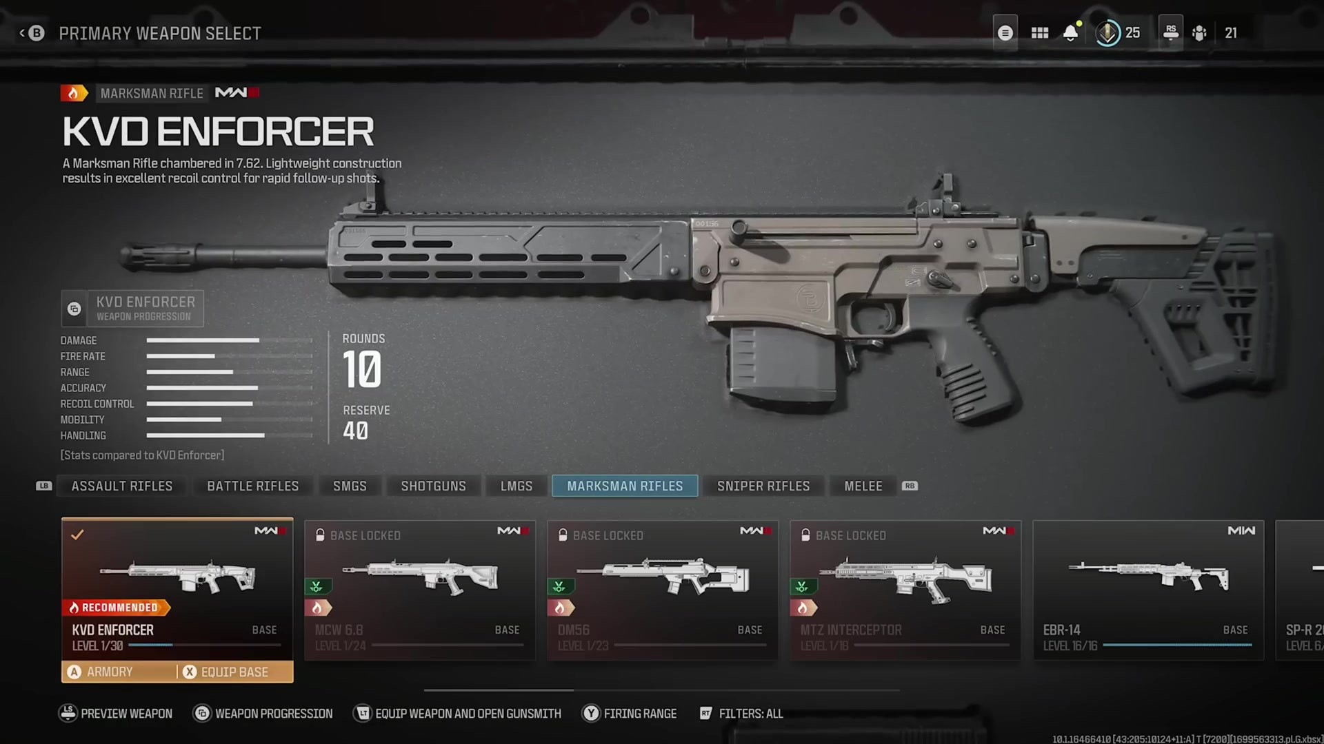
We crafted a custom variable typeface for use across all touchpoints—able to integrate into even the smallest moments within games. The font Hitmarker acts as a baseline to all of our new IP titles with texture and customization applied after.
‘Loud and Clear’ is our overarching design principle, aiming to create layouts that are inspired by military-style utilitarian type. Clarity, brevity, and boldness help the message stand out from the action. These design elements scaled across all IPs, reaching premium titles, mobile games, internal and external events, and esports identities.
List the results
The work brought attitude and consistency to every brand touchpoint. The logo improvement gave it a presence at the top of the brand hierarchy structure. The brand’s first-ever comprehensive guideline document brought rigor and rules to the brand. The typeface acted as a thread between all the IPs, further tying them together. Players finally have a brand that stands to their favorite gaming experiences. The ‘Loud and Clear’ design principle infused into all properties brings clarity of information to what were previously complicated layouts. Hitmarker's optimization for small scales, and blanket integration into the games, brings design consistency and increased legibility to those break-neck, twitchy gameplay moments. The result is a universally-improved perception of the franchise stepping into a grown-up phase as a media entity, with MWII breaking previously held sales records, and MWIII constantly hitting two million concurrent players a month.
More Entries from Rebrand/Refresh of an Existing Brand in Design
24 items
More Entries from KOTO
23 items