Design > Brand Building
EPIDEMIC SOUND BRAND IDENTITY
BOLD, Stockholm / EPIDEMIC SOUND / 2024

Overview
Credits
OVERVIEW
Why is this work relevant for Design?
Epidemic Sound is a global soundtracking platform with a world-class catalog of music and sound effects.
As the brand moves from simply providing a transactional audio library to becoming a true partner for creators, they need a brand refresh that can take them from resource to creative influence.
The result is a radical brand shift from generic tech company to creative juggernaut, powered by a larger-than-life visual identity that rejects cold tech tropes and celebrates fun, joyous design — uniquely blending classic geometry with an eclectic collage approach in an effort to inspire, surprise and elicit a response.
Is this product available for purchase?
Yes. Epidemic Sound offers its services through a subscription available in three different tiers, varying in price and complexity: personal, commercial, and enterprise.
The subscription can be bought online:
epidemicsound.com/pricing/
Please provide any cultural context that would help the Jury understand any cultural, national or regional nuances applicable to this work.
In 2009 Epidemic Sound disrupted and democratised the business of commercial soundtracking with the idea of offering access to an entire catalogue of licence free music and sound effect through a simple subscription.
In the 15 years since its founding, Epidemic Sound has successfully expanded its global presence, attracted world class funding and talent, and cultivated a reputation as a tech startup. However, its brand and business model have also spurred competitors, resulting in a category filled with similar offerings and brand tropes.
In a great leap to defend and strengthen their category leadership, Epidemic Sound developed a new strategy and position — placing a big bet on moving beyond their public perception as a generic tech provider by unlocking their creative culture, inspiring product and supportive partnership to the creators of the world.
Background
As global soundtracking platform Epidemic Sound moves from providing a transactional audio library to becoming a true partner for creators, they need a brand that looks, moves, and speaks like the creative partner they really are.
From the starting point of a new business strategy and brand platform, this Brand Refresh project ran over approximately 12 months, focusing on developing a holistic concept and system for aligning all parts of the brand experience — how it feels, talks, sounds, moves and looks.
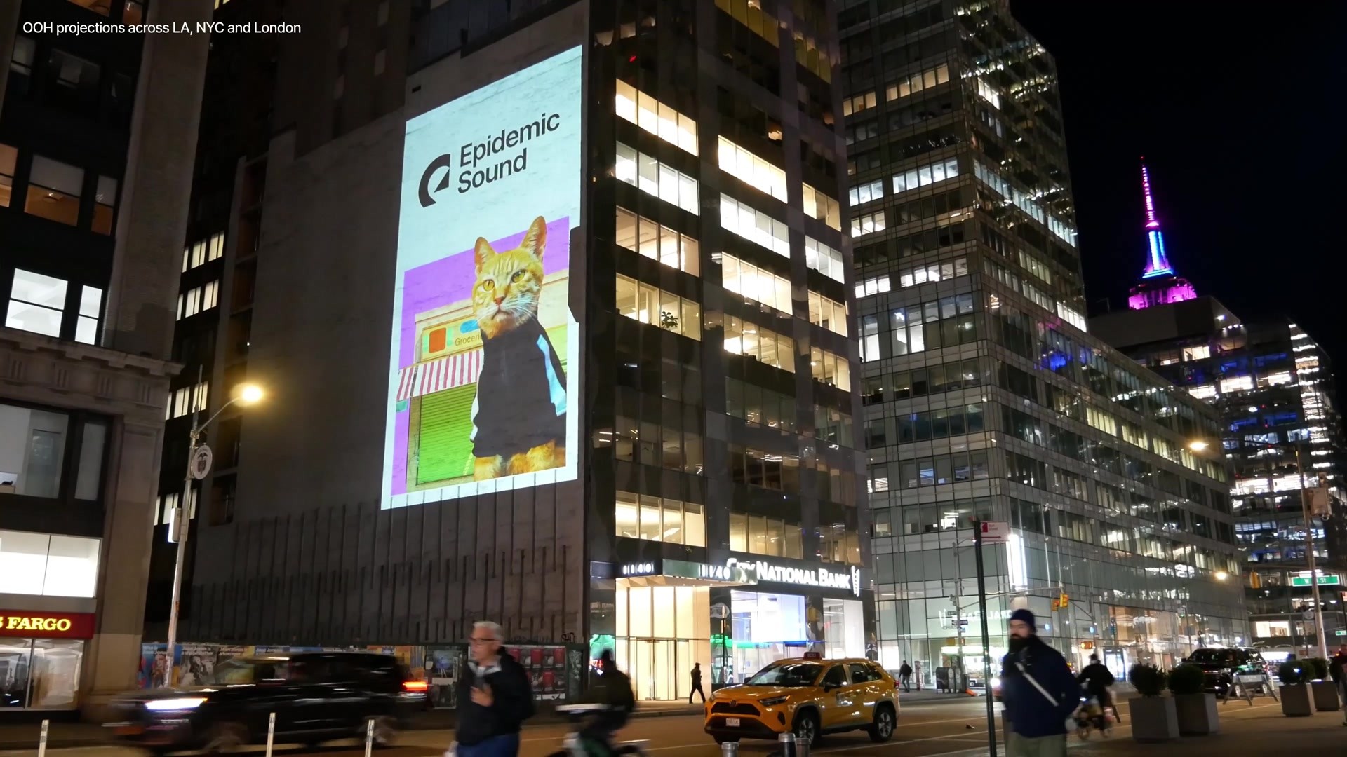
The scale of the identity implementation ranged from a full reskin of the product UI and all other branded touchpoints, to an extensive launch campaign led by OLV, paid social, guerilla and 100+ bespoke and unique OOHs and projections (with connected campaign sites) across NYC, LA and London during Feb-Mar 2024.
Describe the creative idea
The focus of this brand refresh lies in breaking free from tech category tropes and unlocking Epidemic Sound’s creative core.
The overarching concept ‘Sound that moves’ was born from the ambition of creating a fun and inspiring experience throughout the brand, reflecting the product and partnership that Epidemic Sound offers to composers, influencers, creators and global brands.
‘Sound that moves’ carries two meanings — it articulates how ES’ intuitive product allows sound to seamlessly move to the user’s will, as well as the emotionally moving quality of its catalogue composed by human musicians. This versatility enables the design solution to communicate both tech-focused and creative-driven messaging — allowing it to flex across the smallest UI to the most expressive OOH campaigns.
The result is a radical shift from category norm to creative juggernaut that aims to speak directly to the creator community and reflect their inspiring creativity back at them.
Describe the execution
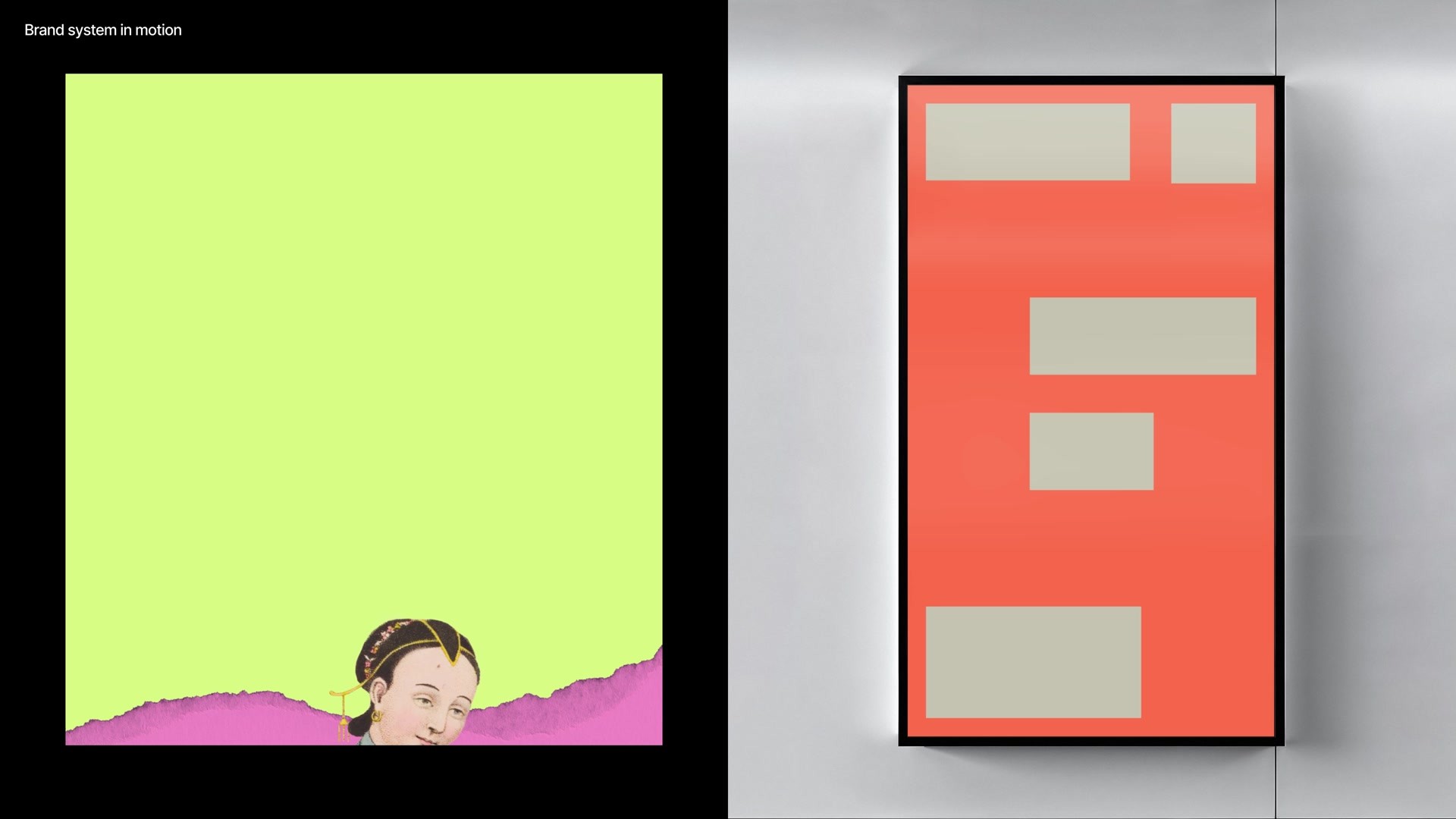
The new identity is composed of rectangular building blocks called ‘stacks’ — a direct visual reference to the soundtracking interfaces that Epidemic Sound users are familiar with. These core stacks come together in a variety of staggered configurations to form the visual foundations of the brand.
This sober, geometric structure then sets the scene for an explosion of human creativity — housing rich eclectic collages that take the brand into an unexpected space. The inspired mix of everything from retro ephemera and vintage scientific illustrations to hypermodern 3D forms, done organically without formulaic rules (or AI-generated imagery), reflects the boundless world of sonic possibilities coming to life when users create with Epidemic Sound.
This two-thronged, versatile approach allows the ES brand to project cutting-edge sharpness in its technologically-driven product touchpoints, whilst also dialling up irreverent fun and humanness in its comms and campaigns aimed at the creative community.
List the results
The new brand identity was just launched at the end of February 2024, so we are unable to track its longterm impact on funnel and brand tracking metrics as of April 2024.
What we have is design test metrics on identified important category drivers and brand associations, which were verified in quantitative pre-studies to have the highest impact on volume and price premium.
Difference between New and Old Design:
- Playful +57%
- Unique +36
- Creative +34%
as well as a decrease in the negative association:
- Technical -13%
More Entries from Rebrand/Refresh of an Existing Brand in Design
24 items
More Entries from BOLD
24 items
