Industry Craft > Typography

LEGO TYPEWELL

THE LEGO GROUP, Billund / LEGO / 2024
CampaignCampaignLayout(opens in a new tab)
Supporting Images
Supporting Images
Supporting Content

Overview

Credits

Overview

Why is this work relevant for Industry Craft?

First created in 1949, LEGO bricks are still enjoyed by families around the world. They remain relevant in part because the LEGO Group deliberately made its form of creative play accessible in an increasing number of stories—through its franchises and those of partners like Disney and Marvel. The LEGO Group’s incredible success led to a unique challenge – ensuring consistency and connectivity across their diverse and ever-growing worlds.

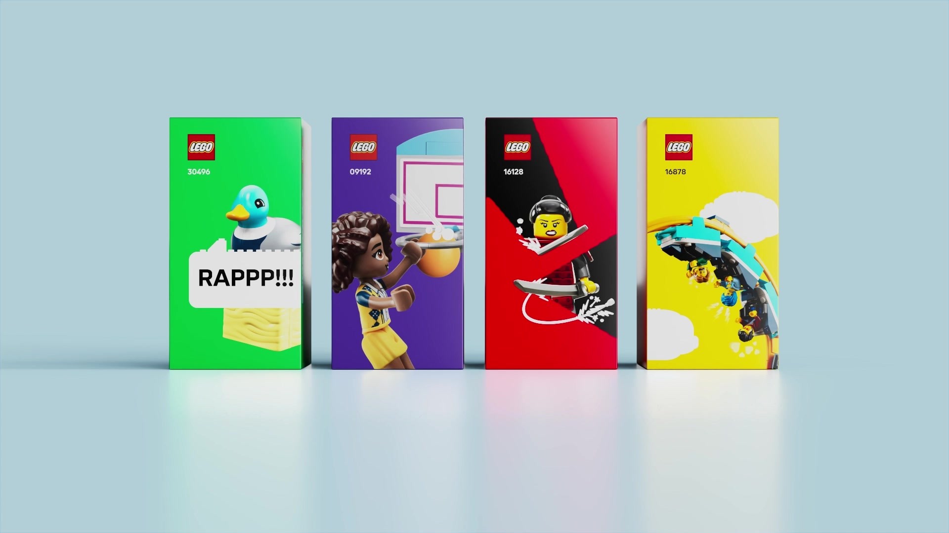
We brought cohesion to the entire LEGO ecosystem by creating a set of unique assets for the brand beyond the logo; a full set of LEGO elements that can create absolutely anything.

Please provide any cultural context that would help the Jury understand any cultural, national or regional nuances applicable to this work.

The new LEGO system was created to build cohesion globally and empower creative play for those designing brand experiences as much as the people who enjoy them. Also, in parts of the world the LEGO brand and products are copied and sold as a rival company. By creating more recognizable brand cues we created a competitive moat to build attribution for the LEGO Group.

Background:

Building the LEGO set of elements took over two years to complete. It was conceived then rigorously tested across different groups within the LEGO Group to ensure the system would be accepted across the organization. We tested the elements with six working groups that were used to pressure test the solution.

Tell the jury about the typography.

To deliver a more connected ecosystem, we dove into the LEGO archives to understand what makes the brand so special.

A major part of the refreshed LEGO brand is the first global brand font, LEGO Typewell, which is now available in 120 languages. It is inspired by the geometry of the LEGO System-in-Play, and it looks and feels just like the bricks.

We utilized the classic characteristics of the brick and replicated its angles and curves throughout. When the font is used any communication, it automatically feels like the LEGO brand, even if the logo isn’t visible.

The final unique trait of the font is flat vertical edges. This quirk was originally found on a box deep in the LEGO archive. By using the flat edges, it makes the font feel pushed together like the suction of the bricks.

More Entries from Typography: Brand & Communications Design in Industry Craft

24 items

Grand Prix Cannes Lions
THE 100TH EDITION

Photography: Print & Publishing

THE 100TH EDITION

FRANKFURTER ALLGEMEINE ZEITUNG, SCHOLZ & FRIENDS

(opens in a new tab)

More Entries from THE LEGO GROUP

24 items

Bronze Cannes Lions
LEGO FORTNITE

Brand Integration for Games

LEGO FORTNITE

LEGO, THE LEGO GROUP

(opens in a new tab)