Industry Craft > Art Direction
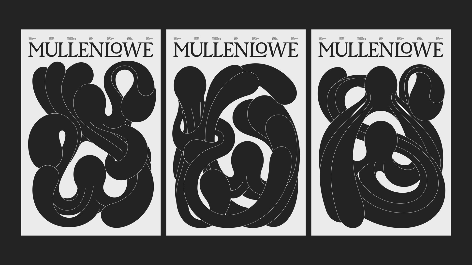
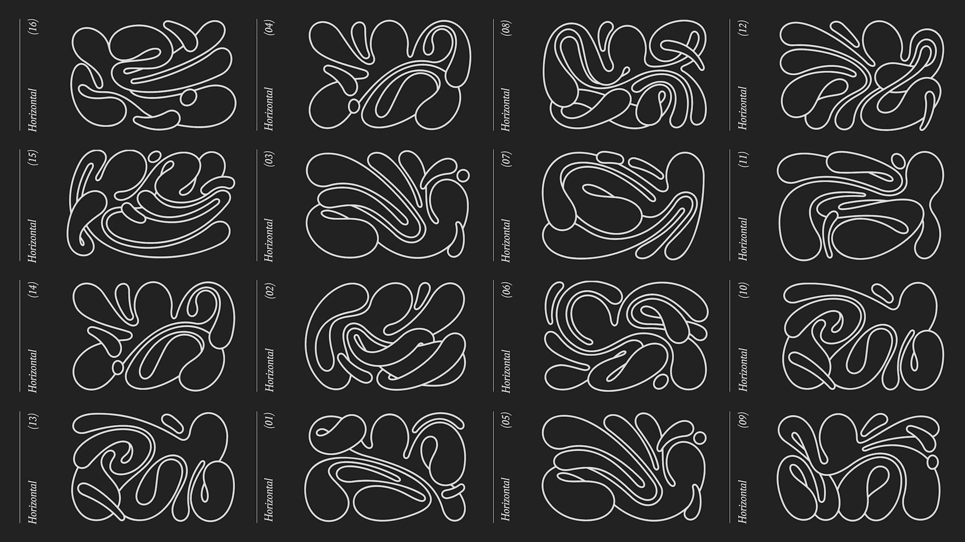
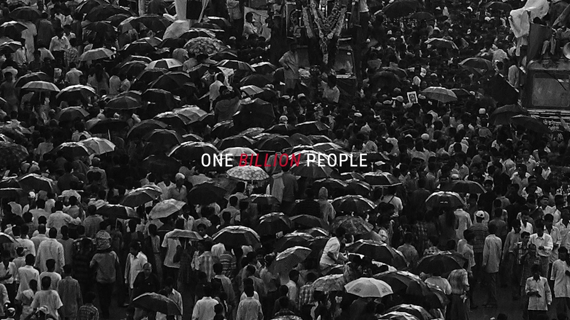
MULLENLOWE GLOBAL REBRAND
MULLENLOWE U.S., New York / MULLENLOWE GLOBAL / 2024
Awards:
Shortlisted Cannes Lions
1 of 0 items
Overview
Credits
More Entries from Art Direction: Brand & Communications Design in Industry Craft
24 items
More Entries from MULLENLOWE U.S.
24 items