Design > Corporate or Brand Identity

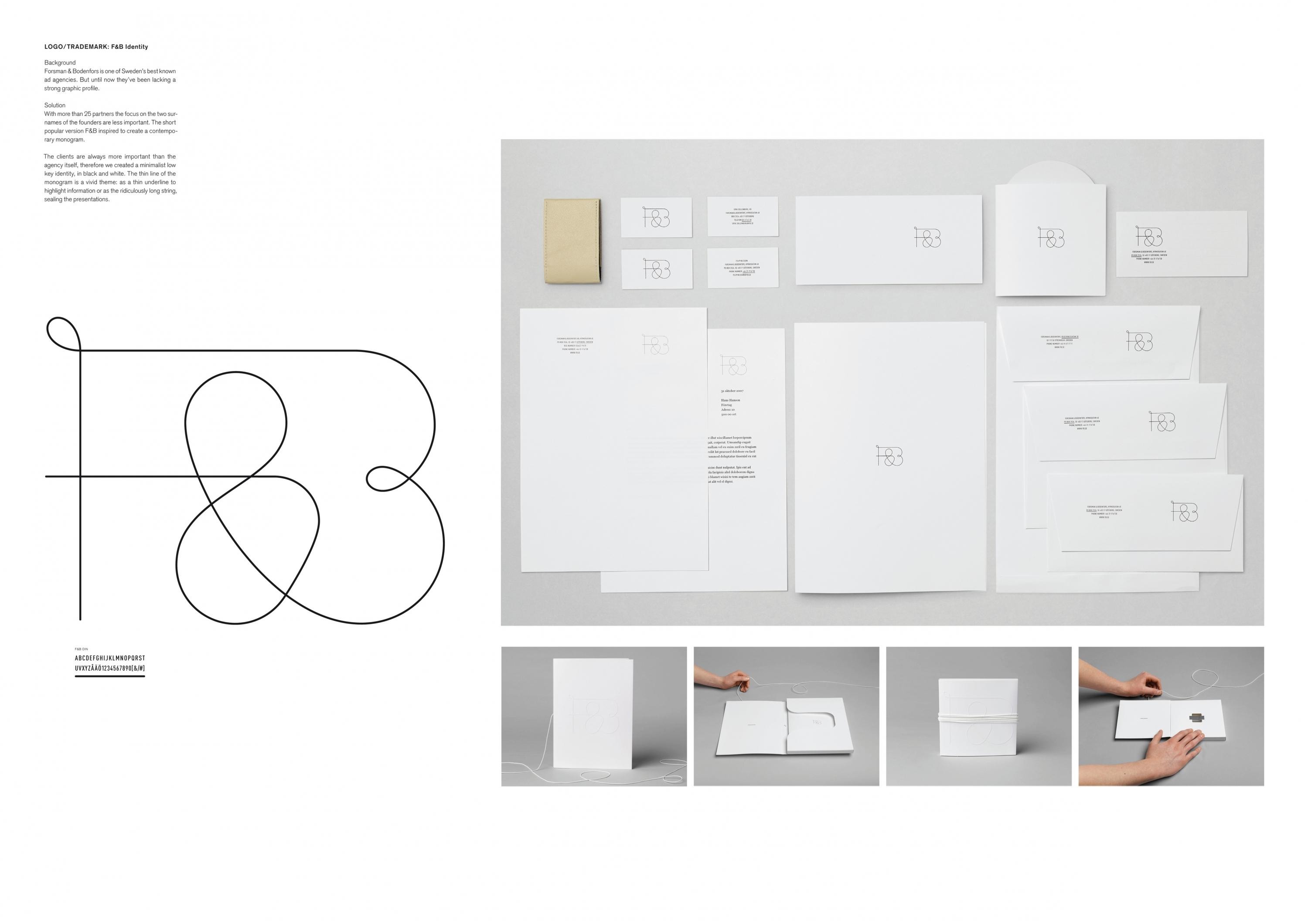
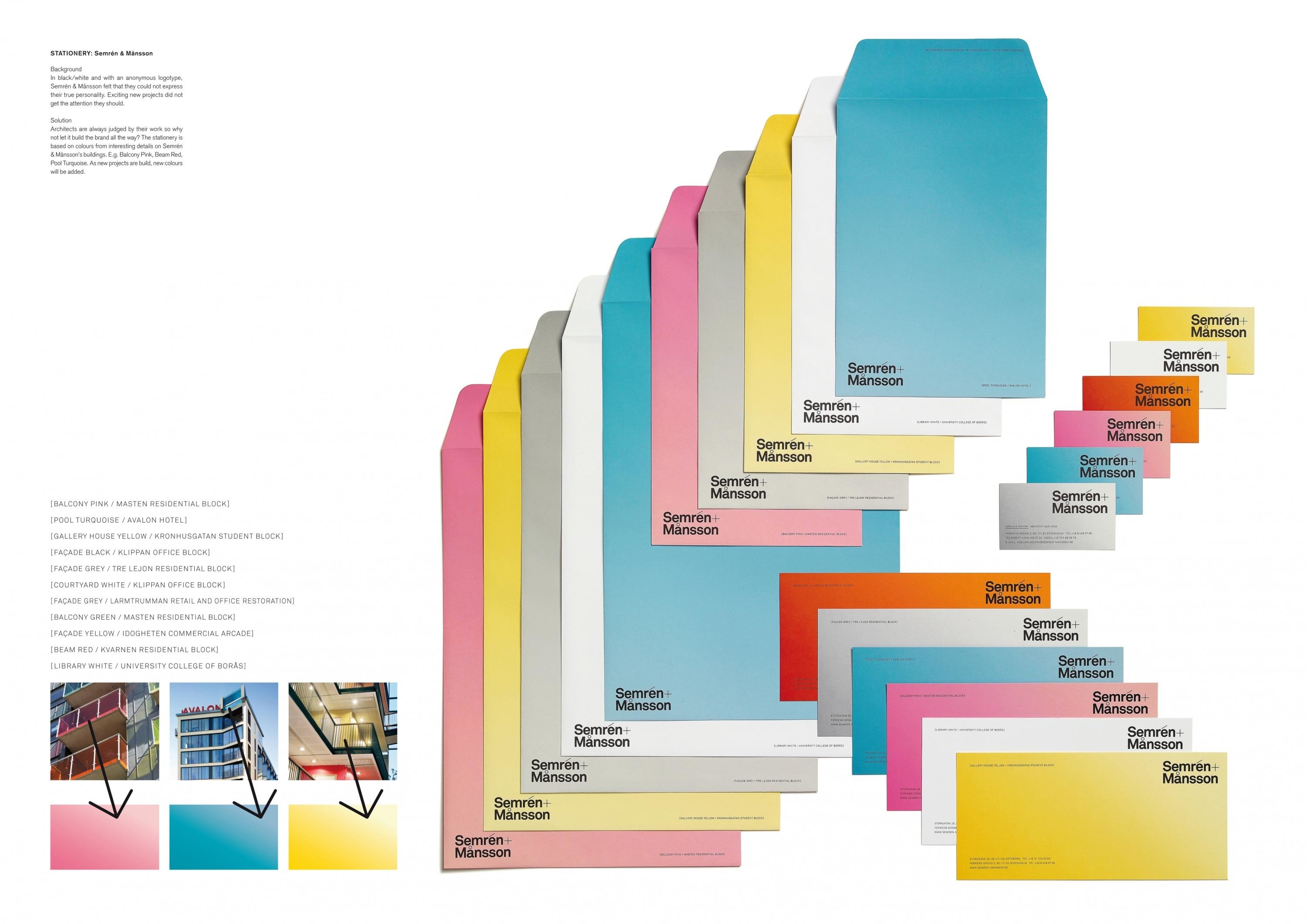
SEMRÉN & MÅNSSON IDENTITY

HAPPY F&B, Gothenburg / SEMREN & MANSSON / 2009

CampaignCampaignLayout(opens in a new tab)
Presentation Image
1 of 0 items

Overview

Credits

OVERVIEW

BriefExplanation

The business objective is to communicate the agency in a personal way that separate them from their competition and makes them memorable. Since the colours are picked from real buildings designed by Semrén & Månsson, the business objective is also to start a conversation and get people to notice the work.

ClientBriefOrObjective

The technical challenge was to create colours that look just like the objects they were picked from. Since we used coloured paper, we had to design custom made envelopes.

Effectiveness

Positive references from clients.

Execution

Architects and their identities are almost always black and white. To focus on this firm's somewhat different and more market oriented position, we added colour in a vivid, relevant way.

The colours are based on interesting details on Semrén & Månsson's buildings. E.g. Balcony Pink, Pool Turquoise.

More Entries from Stationery in Design

24 items

Grand Prix Cannes Lions
PAPER BATTLEFIELD

Posters

PAPER BATTLEFIELD

NIKE, McCANN WORLDGROUP

(opens in a new tab)

More Entries from HAPPY F&B

24 items

Silver Cannes Lions
LOST & FOUND

Publications & Business Communications

LOST & FOUND

GOTEBORGSTRYCKERIET PRINTING HOUSE, HAPPY F&B

(opens in a new tab)