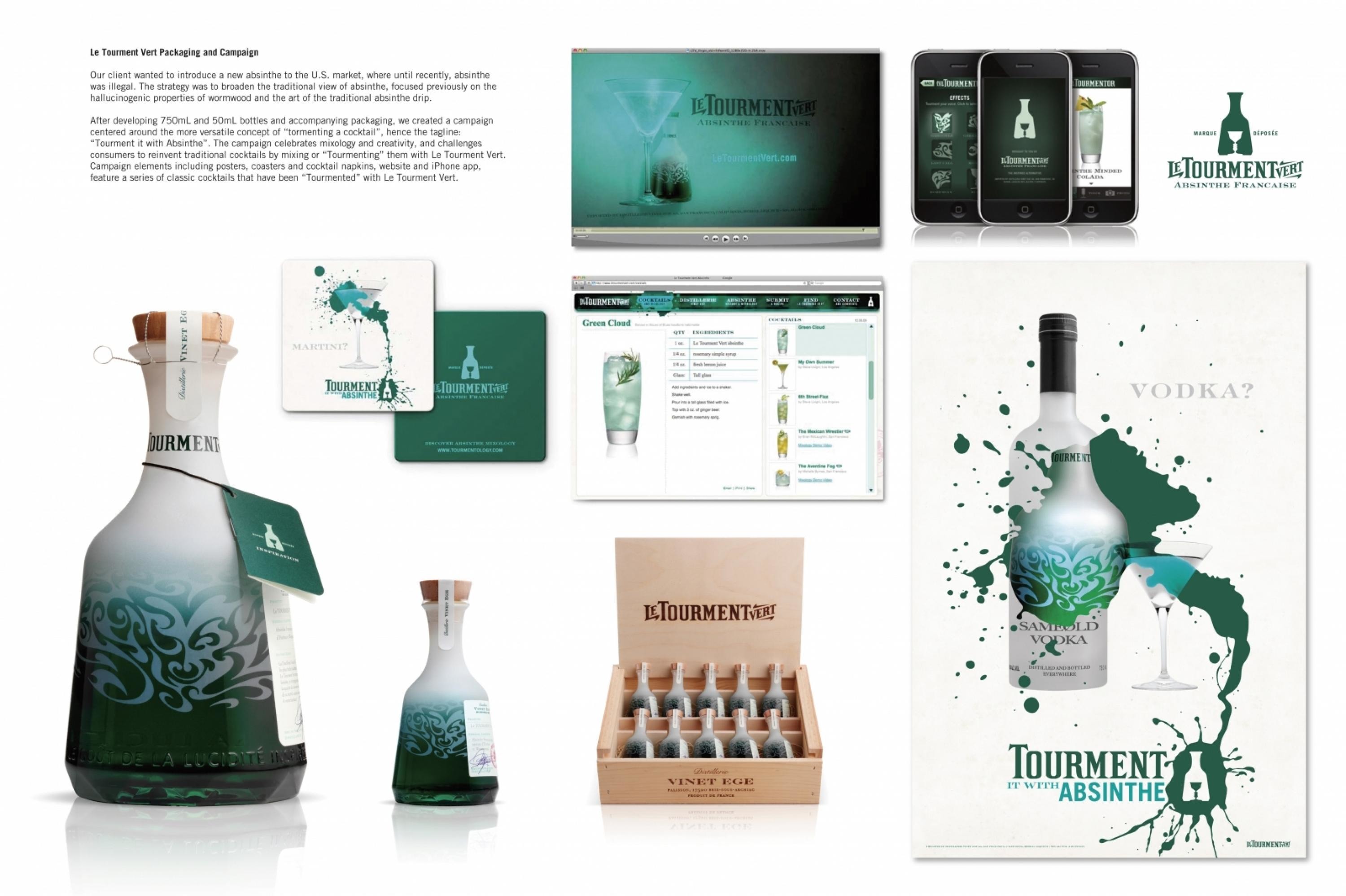
Design > Brand-building
EQUAL JUSTICE INITIATIVE
TURNER DUCKWORTH, San Francisco / EQUAL JUSTICE INITIATIVE / 2019
Awards:

Overview
Credits
OVERVIEW
Background
Founded in 1989 by Bryan Stevenson, the Equal Justice Initiative is a private, 501(c)(3) nonprofit organization committed to ending mass incarceration and excessive punishment in the United States, to challenging racial and economic injustice, and to protecting basic human rights for the most vulnerable people in American society.
Because EJI is rooted in law, their original system felt very legal in nature. With the growing reach and influence of EJI, there was an urgent need for their initiatives to visibly tie back to their organization. Our brief was to redesign their visual assets in order to allow EJI’s reach to expand to be more accessible for all. Our goal was to make their content more understandable and shareable, in order to help spread their important message further throughout the nation.
Describe the creative idea
We designed an identity that both lived up to the weight of EJI’s content, and was neutral enough to play second fiddle to it.
Many non-profits, institutions, and grassroots organizations occupy this space. However, it can be difficult to identify what each brand is offering. We created an identity that is clear and truly differentiated. Moreover, given the multi-faceted nature of the EJI organization, a singular identity was critical.
At the heart of the identity is a symbol that implores us to break the cycle of injustice. Inspired by the name Equal Justice Initiative, two equal letter Js form a broken chain, which not only encapsulates a larger purpose, but also became the symbol for the new Legacy Museum.
Describe the execution
Already armed with inarguable facts and emotionally charged imagery, our system helped to amplify and bring clarity to what has always been a part of EJI.
The bold simplicity of the broken chain led to a series of illustrations that aim to illuminate EJI’s key themes and ideas with immediacy. A restrained color palette of black and warm gray with accents of red was intentionally selected for visual impact, and to infuse a sense of warmth and hope. Clear, unignorable typography is a key part of the system.
Our work for EJI has improved cohesiveness and delivered a flexible set of assets that give the EJI brand room to grow.
List the results
Results are being measured qualitatively through the brand consistency we are seeing in market, from materials produced for the opening of the Museum and Memorial, to EJI’s digital and social presence since the release of the visual identity.
Visitors to the Museum and Memorial in 2018 have already exceeded set goals as they have already had over 100,000 visitors to the sites in the first quarter. Traffic to the digital and social sites has also seen an increase.
Ongoing deployment of the new visual identity will enable EJI to increase awareness, impact and scale through additional media and marketing inspired by our work.
More Entries from Rebrand / Refresh of an Existing Brand in Design
24 items

More Entries from TURNER DUCKWORTH
24 items