Design > Corporate or Brand Identity
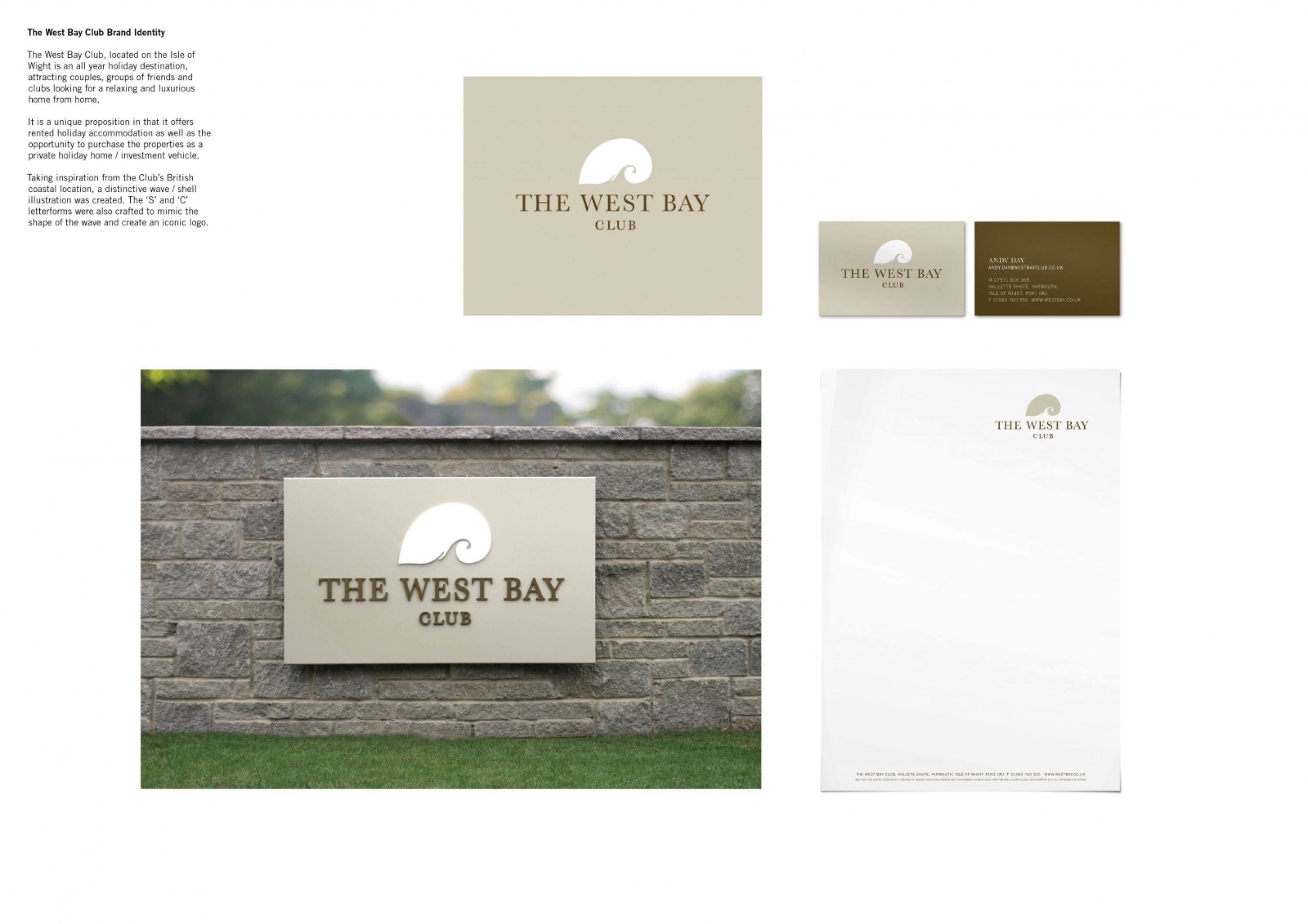
THE WEST BAY CLUB BRAND IDENTITY
TURNER DUCKWORTH, London / THE WEST BAY CLUB / 2010
Overview
Credits
OVERVIEW
BriefExplanation
The West Bay Club is a re-branding of the resort previously known as The Savoy Club. The West Bay Club, located on the Isle of Wight is an all year holiday destination, attracting couples, groups of friends and clubs looking for a relaxing and luxurious home from home
ClientBriefOrObjective
To attract holiday-makers that may convert into investors and buy a property. The club is an all year round holiday destination and as such will attract couples, groups of friends or clubs eg cycling who are looking for a base for a long weekend.
Effectiveness
The transitional rebrand from The Savoy Club to The West Bay Club has been extremely successful, so much so that it has been carried throughout the company from stationary and signage to the website and advertising materials.
Execution
Taking inspiration from the Club’s British coastal location, a distinctive wave / shell illustration was created. The ‘S’ and ‘C’ letterforms were also crafted to mimic the shape of the wave and create an iconic logo.
More Entries from Small Scale Corporate Identity Schemes in Design
24 items


More Entries from TURNER DUCKWORTH
24 items