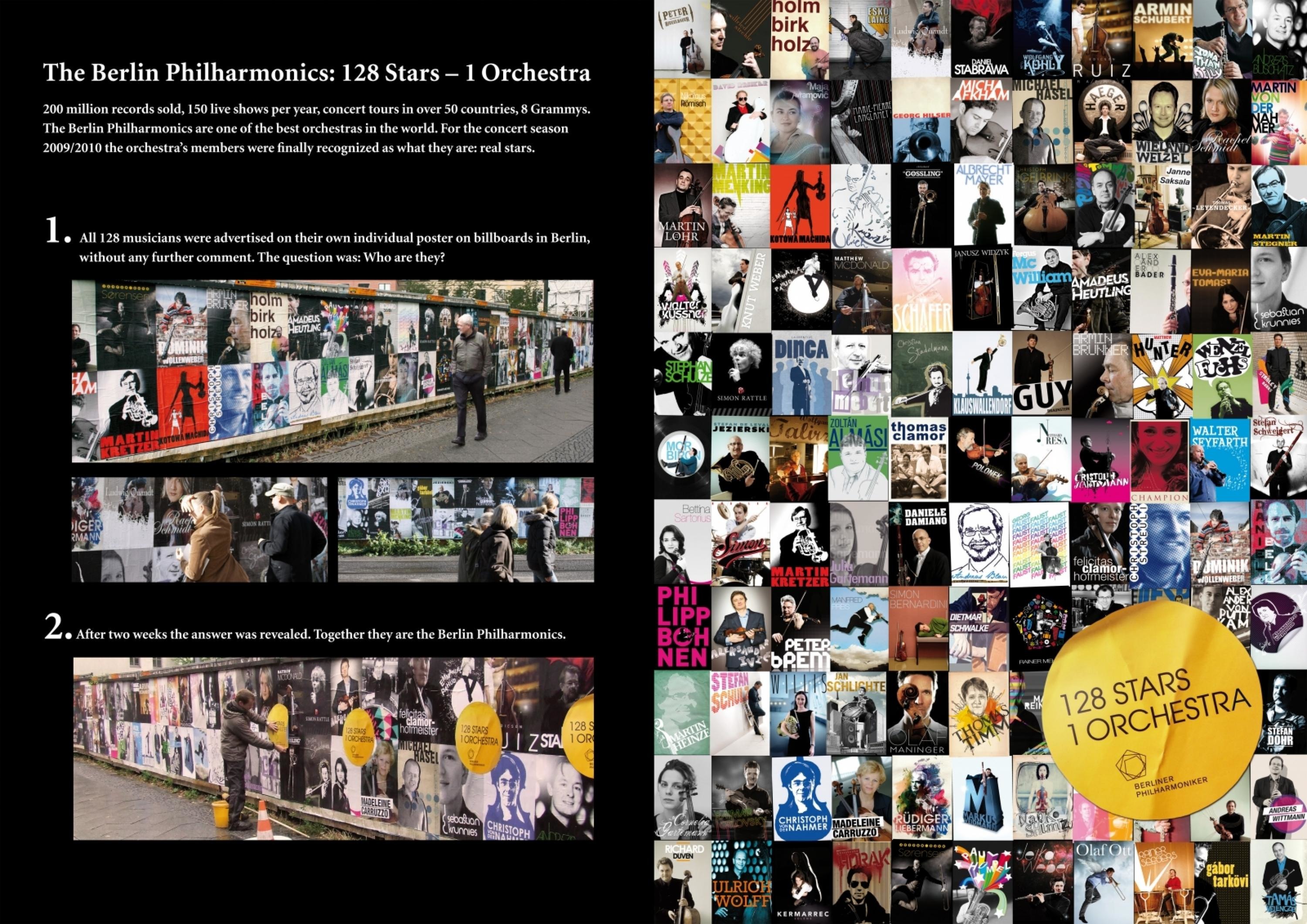
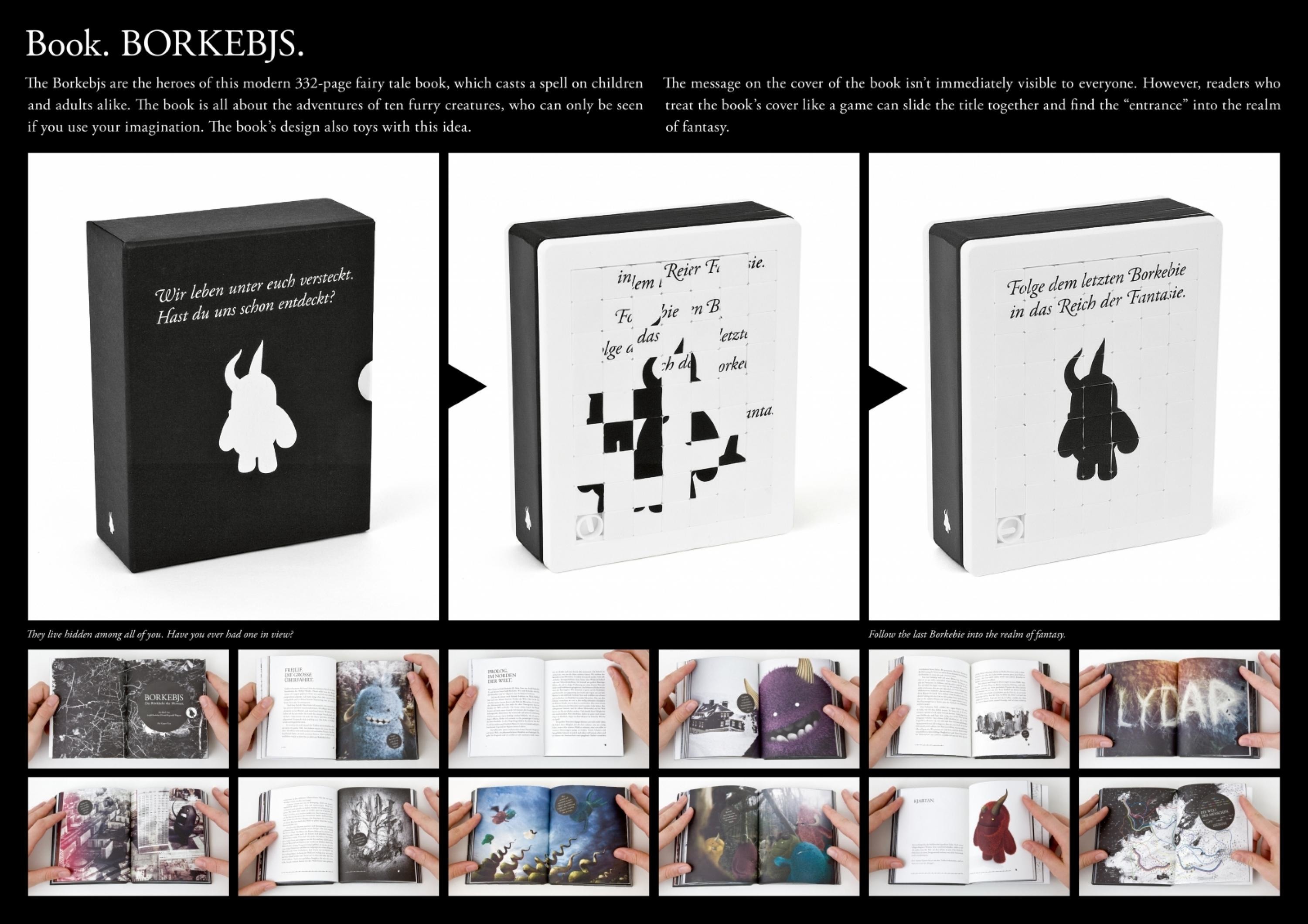
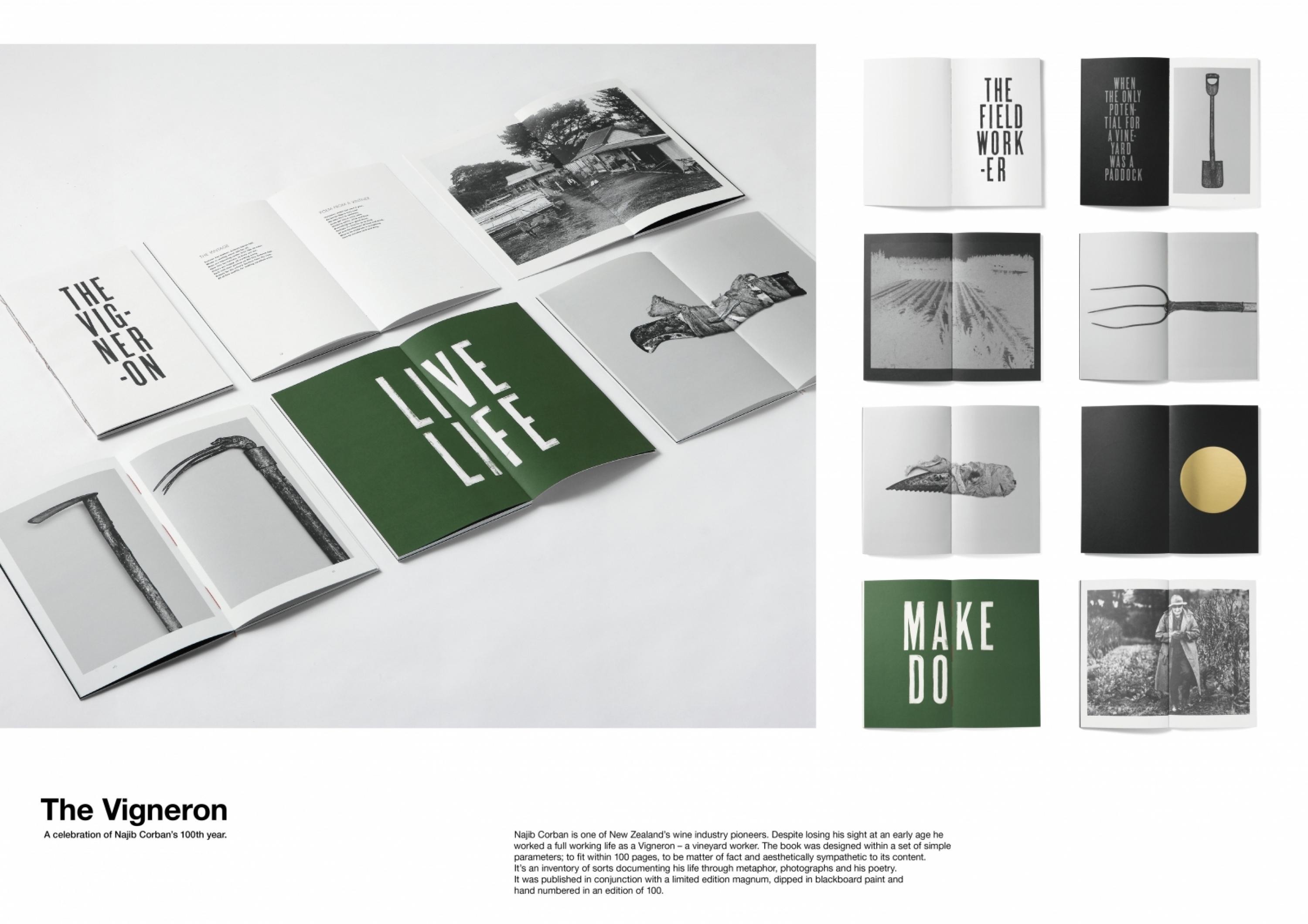
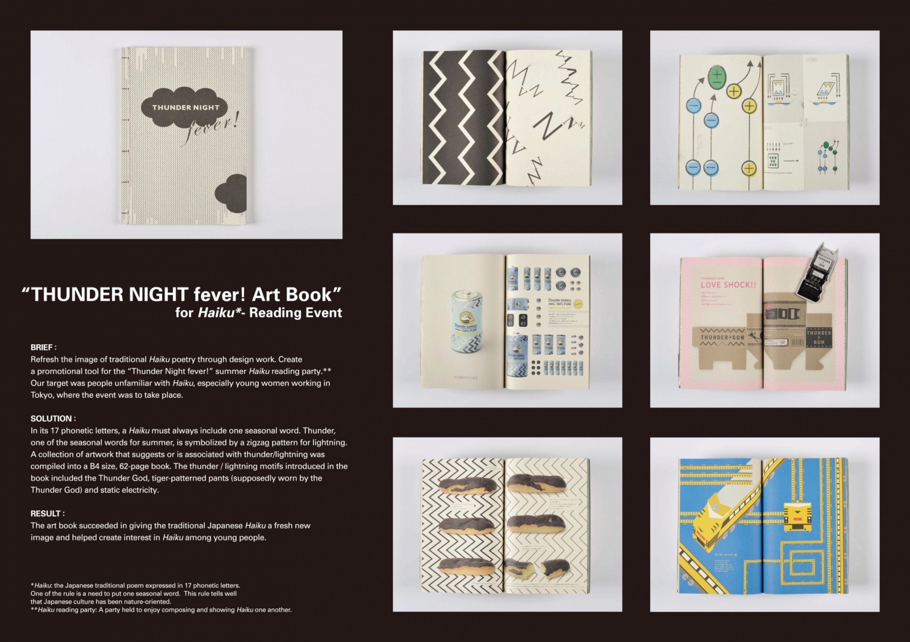
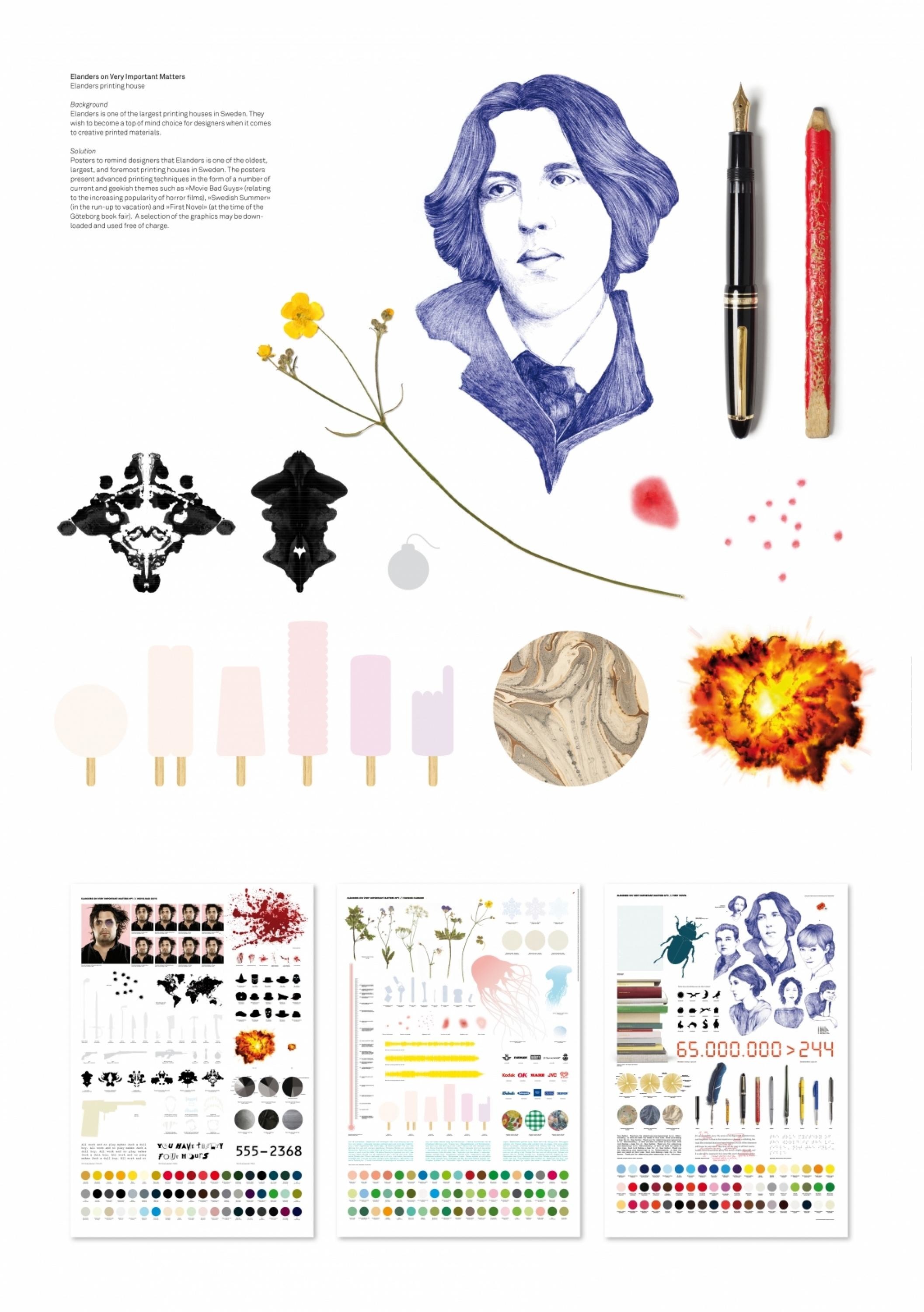
Design > Packaging Design
THE EARPHONES NOTE
SCHOLZ & FRIENDS , Berlin / PANASONIC / 2010
Awards:

Overview
Credits
Overview
BriefExplanation
The brief was to design a new packaging for the Stereo Earphones RP-HJE 130 that clearly communicates the product benefit: the unique sound quality. The packaging design has to appeal to a target group that usually owns well-designed high-class mp3 players.
ClientBriefOrObjective
The selection of earphones is huge and the products are often interchangeable. Only a packaging with a clear visual idea is able to stand out at the market among the generic packagings of the competition.
Effectiveness
The new packaging was met with positive reactions from retailers and clients because it clearly stood out from the generic packaging of the competition. As such it helped to attract new target groups for Panasonic.
Execution
The packaging uses the universal symbol for music: the note. By specially arranging the earphones inside a special box they appear to look like two eighth notes. So the earphones show at first sight for whom they are made: for passionate music lovers.
More Entries from Electronics, Computers & Audio-Visual in Design
24 items


More Entries from SCHOLZ & FRIENDS
24 items