Design > Corporate or Brand Identity
URBAN ABSTRACT
MUSUTA, Helsinki / SANOMA TELEVISION OY NELONEN / 2010
Awards:
Overview
Credits
Overview
BriefExplanation
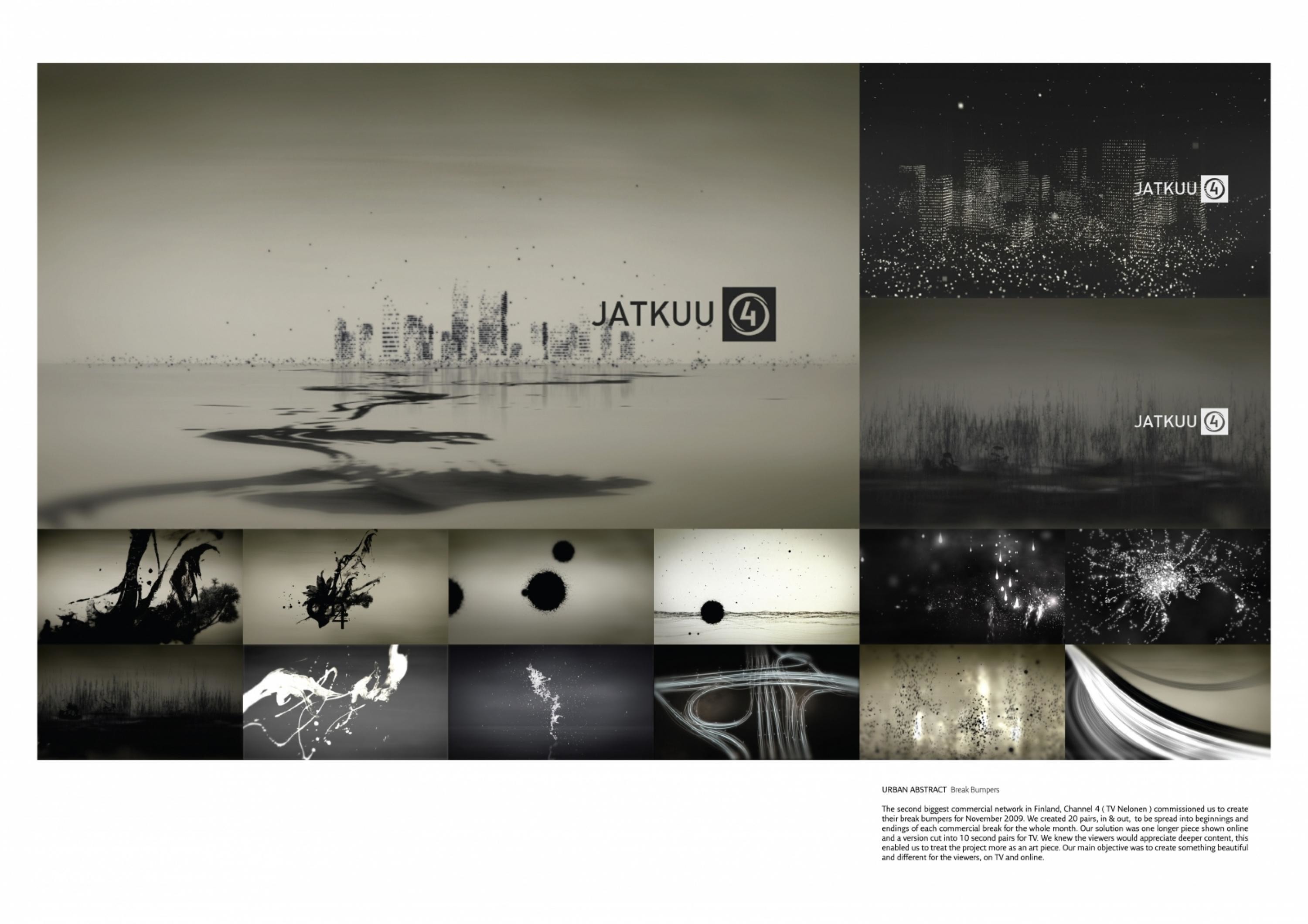
Channel 4 (TV Nelonen) - Something totally differentAs the second biggest commercial network in Finland, Channel 4 (TV Nelonen) wanted us to create something totally different - as their slogan suggests - for their viewers. Nelonen asked us to create 20 pairs (5 seconds in, 5 seconds out) of break bumpers to the 5 seconds space between a program and a commercial break. Their target demographic groups were urban, young people and young adults. Our break bumpers were shown for the whole of November in every commercial break. Additional material for online use was also welcomed by the client.
ClientBriefOrObjective
From the very beginning of the project we decided to create a long piece that would work as a shortfilm online. Something that could also be easily cut into 20 ten seconds pairs for TV. We wanted the pairs to work as individual stories in & out as well as the long version.This was quite ambitious, but we decided that the viewers would appreciate deeper content and it would also enable us to treat our piece more as an art piece.Our main objective was to create something beautiful and different for the viewers on TV and online.
Effectiveness
There is really no measure for this. The idea of the break bumpers is to strengthen the Channel 4 (Nelonen) brand and give viewers something to think about. Viewer feedback was excellent and the bumpers were considered beautiful. Viewer comments confirmed what we and the brief aimed for: to create something beautiful and different for the viewers. Online the long version (which was made fully embeddable) received a lot of attention and was widely spread in blogs, video services etc...Even after being aired in November the video and website are still receiving consistent daily traffic without any further promotion.
Execution
Commercial breaks and TV programming can be quite hectic sometimes, so we decided to go very easy on colour and our result is almost black and white.
The style of the short(s) is fluid and, though seemingly random, streams into a cohesive whole. Perhaps watching them in different order would be more like seeing the same journey from another point of view. The sound world is also very important, movement in space is sensed even if watching the shorts with eyes closed. Sounds overlap, fade, come and go.We wanted the viewers to experience a journey in Urban Abstract.
More Entries from Broadcast Design & Graphics in Design
24 items


More Entries from MUSUTA
4 items

