Design > Brand Building
KIKIN BRAND IDENTITY
KOTO, London / KIKIN / 2024

Overview
Credits
OVERVIEW
Why is this work relevant for Design?
A bold, unique illustration style is a powerful asset to show the reciprocal affect that even trivial things, like the way you finance your company, can affect the world around you.
The human tone and playful brand experience helps build trust in an otherwise cold and clinical category that leads with numbers over benefits.
Is this product available for purchase?
Yes
Please provide any cultural context that would help the Jury understand any cultural, national or regional nuances applicable to this work.
With a move towards more sustainable business models and ethics, Kikin brings a humanist brand to the cold, tech focused financial space. Grounded in the idea of community, the brand celebrates founders with shared principles, and rewards businesses that are better for the planet with lower repayments.
Background
Introducing Kikin, an alternative to traditional financing that rewards businesses that are good for people and planet. Pre-revenue and pre-product, Kikin needed a bold identity to launch their vision for the future, and get businesses to sign up to an alternative, greener way to fund pioneering startups.
A short, 5 week design process with a budget of <£100,000
Describe the creative idea
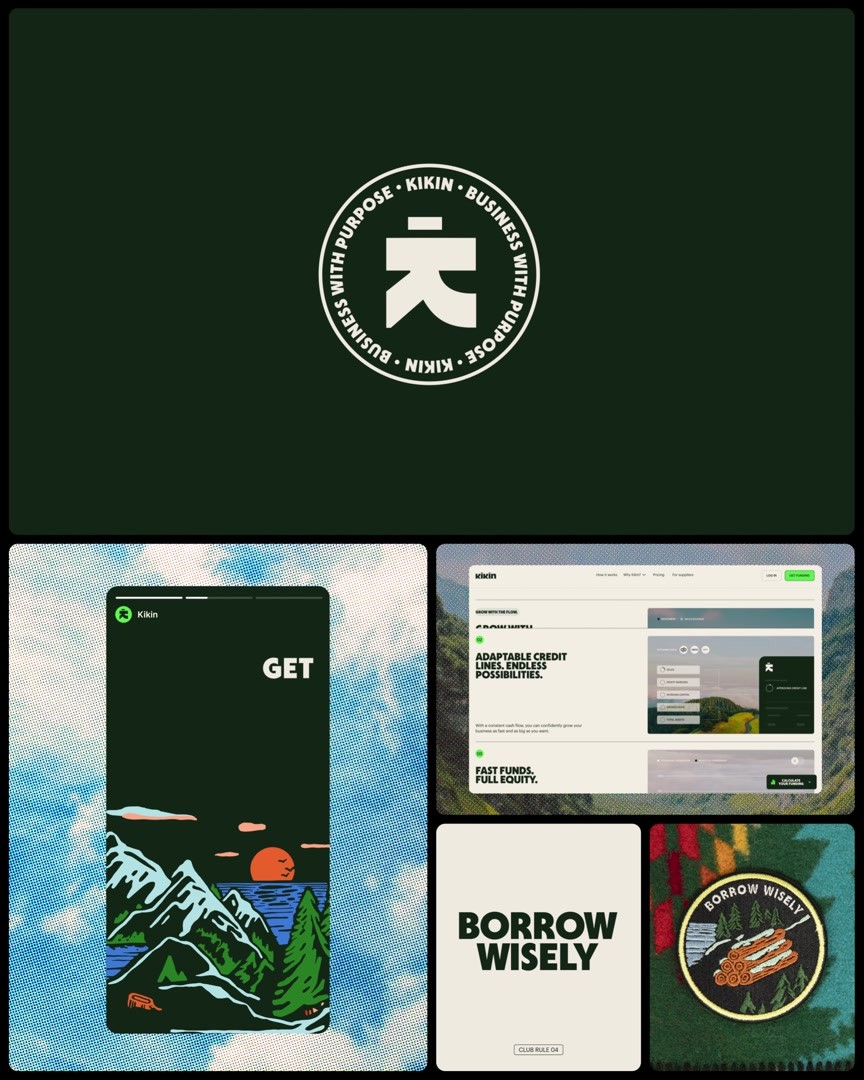
At the core of every brand is a solid idea. For Kikin, this idea was ‘Move Together’. The logic: give good, get good back – Kikin backs better business, and a brighter future for people and planet. Real change comes when we band together to work towards a common goal. The Kikin brand is built around the idea of harmony between people and planet, underpinned by a club-like visual language. We brought a sense of depth to the brand with a bespoke illustration style inspired by clubs that put the outdoors first and make you want to be a part of the community.
Describe the execution
The Kikin brand is built around a club-like visual language.
The wood-cut illustration style harks back to outdoor clubs of the past, from Park rangers to Scouts and Guides.
These illustrations are a vessel to visualise five key shared principles at the heart of Kikin in the form of badges; the five badges come together to create two landscape illustrations that depict a future thriving world. This illustration system gives the brand the ability to stretch from big hero illustration led comms, to smaller, more contained moments.
A bold approach to tone of voice and typography gives Kikin a challenger spirit.
Our logo with humanity at it’s heart; from the twitching symmetric titles, to the symbol that literally depicts a person, the logo is a warm, human breathe of fresh air in an otherwise corporate landscape.
List the results
Since launching their new brand in November 2023, Kikin have surpassed their 6 month revenue target within 3 months, are on track to achieve £4.4 million in sales and have attracted several startups dedicated to doing good for the world. The launch created the foundations for customer growth and has seen them surpass milestones beyond what they imagined.
They attribute their success to the brand’s dynamism and unwavering commitment to positive change.
More Entries from Creation of a New Brand Identity in Design
24 items
More Entries from KOTO
23 items