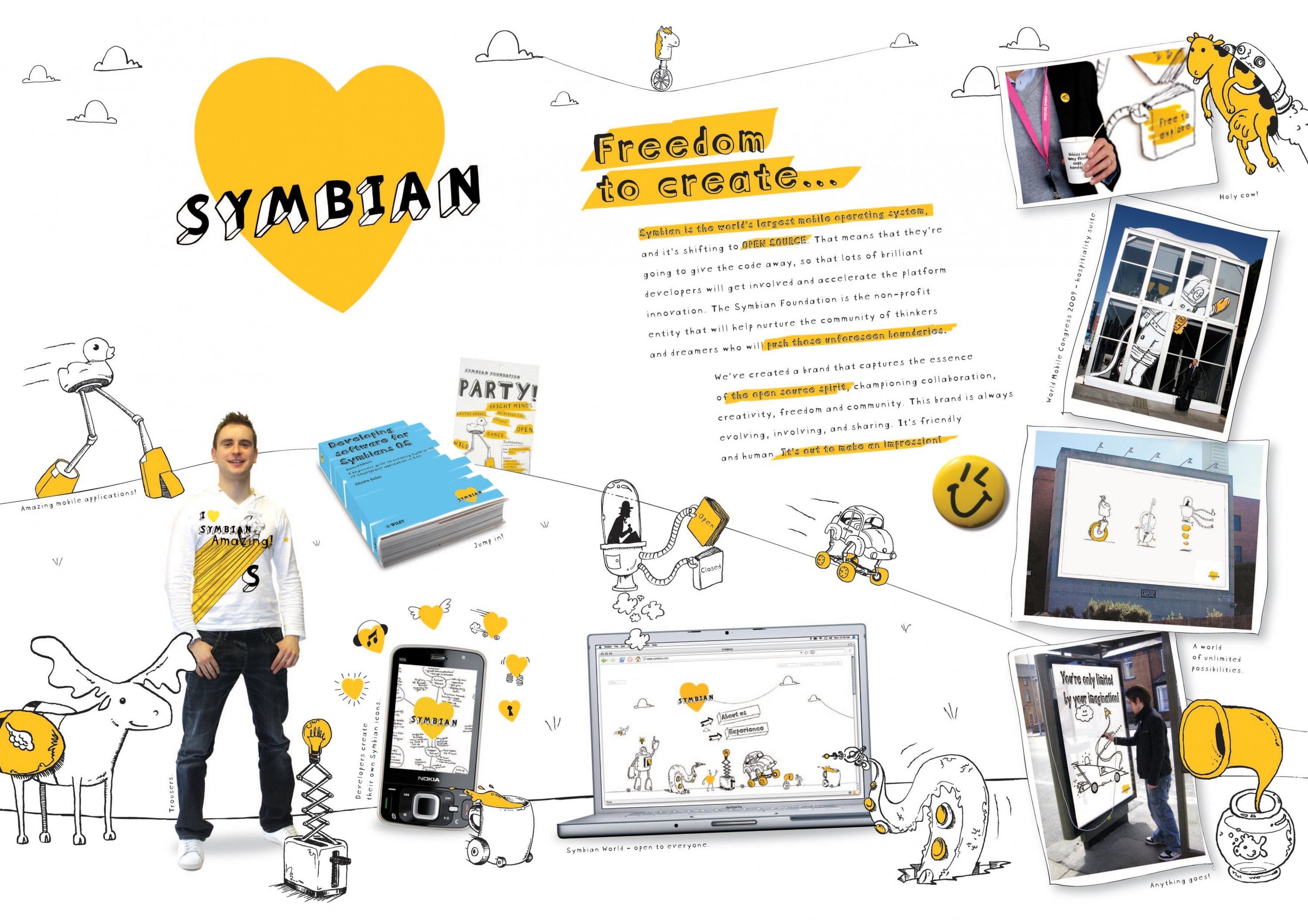
Design > Corporate or Brand Identity
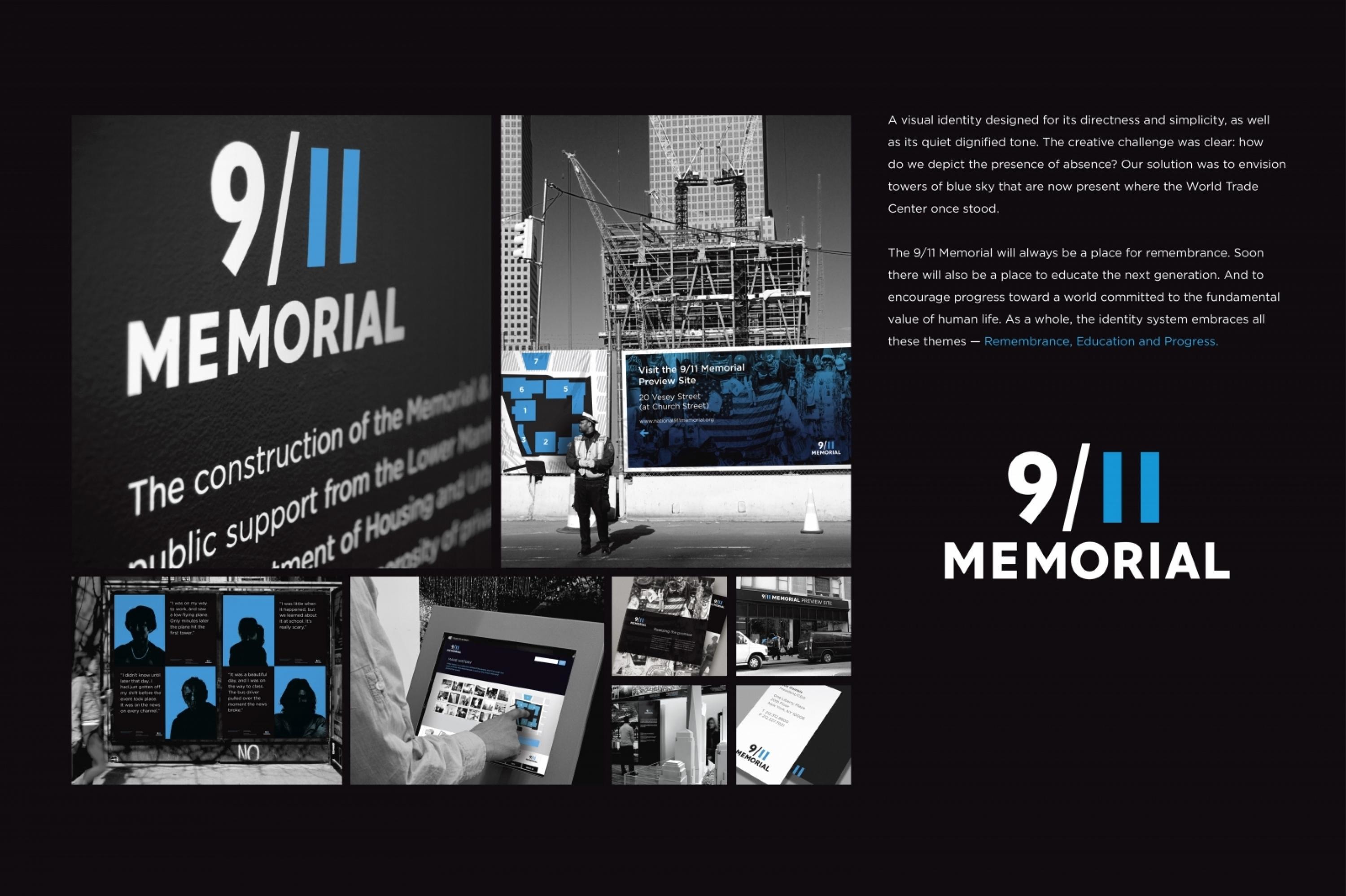
9/11 MEMORIAL
LANDOR ASSOCIATES, New York / NATIONAL SEPTEMBER 11 MEMORIAL / 2010
Awards:
Overview
Credits
OVERVIEW
BriefExplanation
The National September 11 Memorial & Museum at the World Trade Center approached us to create an identity that would make the memorial accessible and stand as a symbol of strength. We were asked to develop a new, shorthand name and visual identity. The organisation realised that their full, legal name was too long and unwieldy for most applications; leading to inconsistent use and public confusion. With the name change came the need to create a new visual identity. The organisation desired a visual identity that would be bold in color and font, and would reinforce the spirit of rebuilding.
ClientBriefOrObjective
As the nonprofit organisation responsible for the design, operations, programming, and fundraising for the Memorial and Museum that is currently under construction at the World Trade Center site, the organisation struggled with how they would offer a consistent experience to the thousands of visitors who tour the site each day. Another challenge they faced was creating a fundraising and merchandising program. How would they sell tasteful, respectful products and memorabilia of an event which represents lost and impacts us all in different ways? From there, the creative challenge for us was clear: how do we depict the presence of absence?
Effectiveness
The new identity continues to receive positive reviews from leading blogs and publications, including Brand New, Identityworks, Album Spin, Time Out New York, and many others. Most recently, internationally acclaimed graphic designer, David Airey featured it as one of the top identities of 2009 and New York based hip-hop artist and rapper, Jay-Z, featured the new identity in his latest music video, "Empire State of Mind" appearing on MTV and VH1 Networks.
Execution
We created a new 9/11 Memorial identity that is effective in its simplicity. This idea was the guiding principle of or work and informed the type style, weight, colour, and arrangement. Finding a balance between a compelling visual style and the proper tone and mood for the memorial was important. The bespoke typography is modern yet timeless, and the eleven is crafted from two austere blue rectangles that reference the shapes missing from the New York City skyline. Combining the date with the building silhouettes creates an essential connection in people’s minds. We believe our solution is also elegant: a characteristic required by a historical institution whose role is remembrance, education and progression.
More Entries from Large Scale Corporate Identity Schemes in Design
24 items


More Entries from LANDOR ASSOCIATES
24 items