Industry Craft > Typography
RAMENFAKTUR - "ONE BOWL. ONE SOUL."
MUTABOR, Hamburg / RAMENFAKTUR / 2024
Overview
Credits
OVERVIEW
Why is this work relevant for Industry Craft?
The products of Ramenfaktur offer both a culinary experience and a sensory delight. Their eye-catching design sparks curiosity and desire to try them. With esteemed delicatessens like Dallmayr expressing interest in showcasing the products on their shelves, we’ve reached a relevant and fulfilling goal. Collaborating with renowned restaurants like Alexander Herrmann’s Imperial is a dream come true. For an emerging company that only recently introduced its brand and design to the market, this success is a triumph of passion and dedication. It is proof that Ramenfaktur products not only tantalize the palate, but also capture the hearts of people.
Please provide any cultural context that would help the Jury understand any cultural, national or regional nuances applicable to this work.
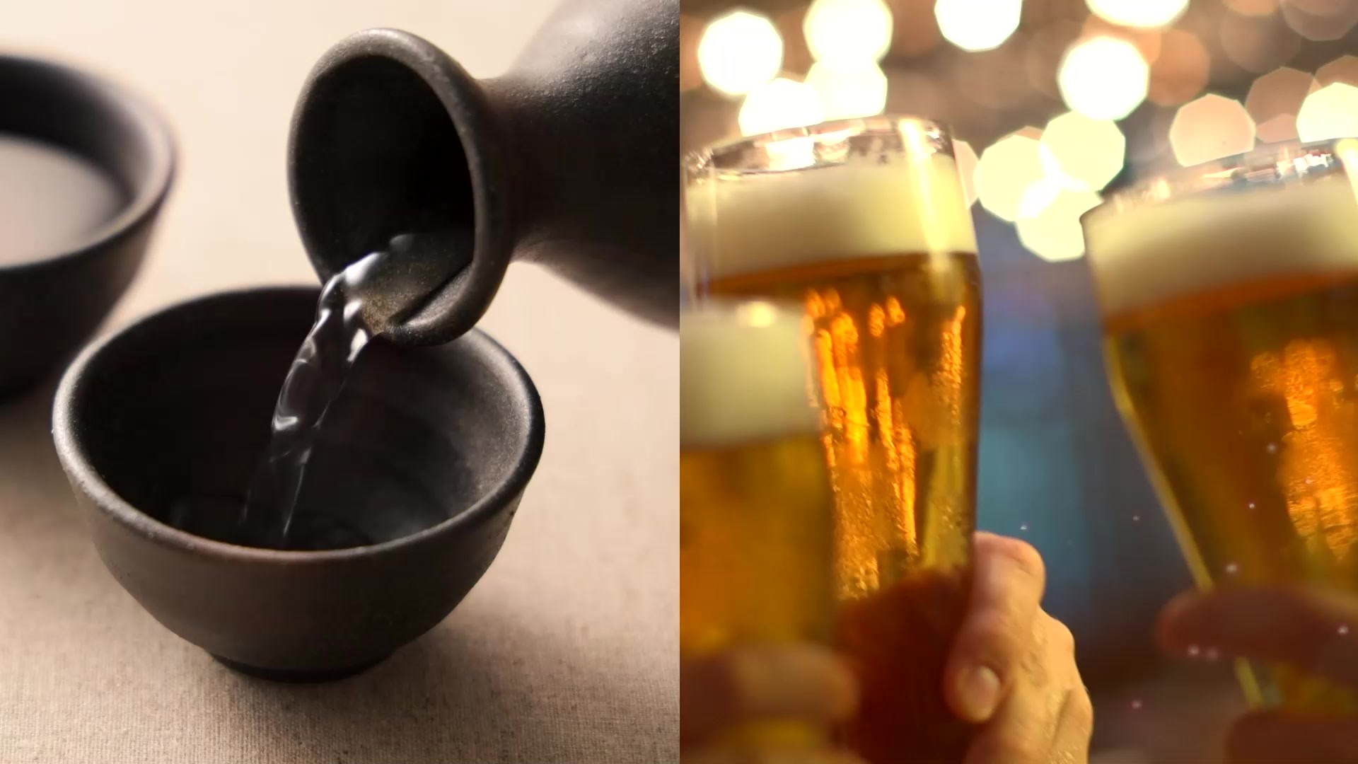
Not only Ramenfaktur is brand-new, but also its product approach. Fresh ramen noodles for homemade meals are not (yet) a big deal in Germany. Therefore, our most important goal was to enter the market loudly and to communicate the brand values of the noodle manufacture – craftsmanship, joy and quality – in a powerful and on-point way. To achieve this, we developed a design that attracts attention on the shelf, entices people to eat ramen, and explains the product simply and quickly.
Background:
Germany's first manufactory for handmade, fresh ramen noodles unites opposites: Japan and Bavaria. Craftsmanship and joie de vivre. With their own small factory in Nuremberg, the company brings a high-quality ramen experience to German kitchens and to ramen fans at home. Just like the products themselves, the appearance of the category is new and unseen. Delicatessen works according to different rules, which we’ve deliberately broken up. Japanese graphics match with classic German Fraktur font, authentic photography with bright colors and patterns. All elements, such as the noodle pattern, the imagery and the illustrative icons, were created from scratch. We also developed a distinctive typography, the "Ramenfraktur". The modern Fraktur font breaks with the tradition of the classic typeface by playing with the bold look of the iconic ramen noodles. The aim was to develop an unseen, high-contrast font that immediately catches the eye and fits the brand perfectly.
More Entries from Typography: Brand & Communications Design in Industry Craft
24 items
More Entries from MUTABOR
24 items