Design > Graphic Design & Design Crafts
FROOSH LOGO
PEARLFISHER, London / FROOSH / 2011
Overview
Credits
OVERVIEW
BriefExplanation
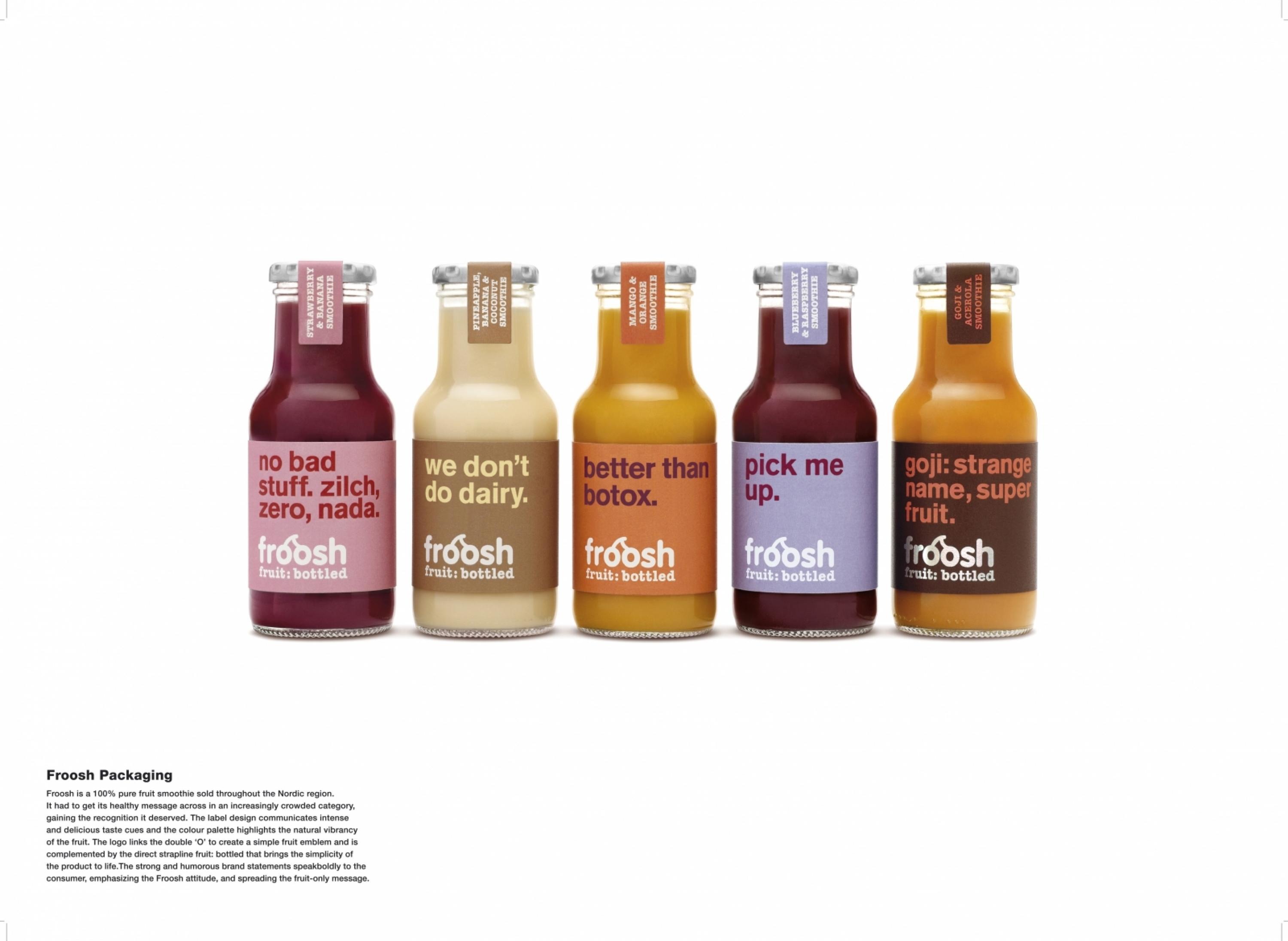
Froosh is a 100% pure fruit smoothie sold throughout the Nordic region. The brief was for an entirely new graphic brand identity brought to life right across the product range and across every form of proprietary media. However the first step of the brief was to capture the essence of the Froosh brand in the form of a new brand logo. With a limited budget Froosh had to get its healthy messages across in an increasingly crowded category and gain the recognition it deserved.
ClientBriefOrObjective
In the Nordic region, where Froosh is sold, smoothies were suffering from consumer misunderstanding – people mistook it for a yoghurt-based drink rather than rejoicing in its fruit-only credentials. The Froosh brand is rooted in the quality of the smoothies. They are great tasting and super healthy. But unlike many other health and wellness brands, Froosh has a refreshingly upbeat, cheeky and irreverent personality. Froosh had to get its healthy credentials across, fight smoothie confusion in the market and also emphasise its personality of living life to the full.
Effectiveness
Froosh was a 5-person team before the re-design. It's now a team of 20. The revenue is up 70% on last year and Froosh are aiming for +100% this year. Froosh has been able to negotiate a 2-year exclusivity deal with one of their largest customers in Denmark (Seven Eleven), which includes the de-listing of innocent smoothies. Froosh expect Chiqita smoothies to disappear from the market, leaving just themselves and Branhults as the only two smoothie brands in Denmark. Finally, Froosh's German supplier states that they're the only company whose fruit orders are increasing rather than in decline.
Execution
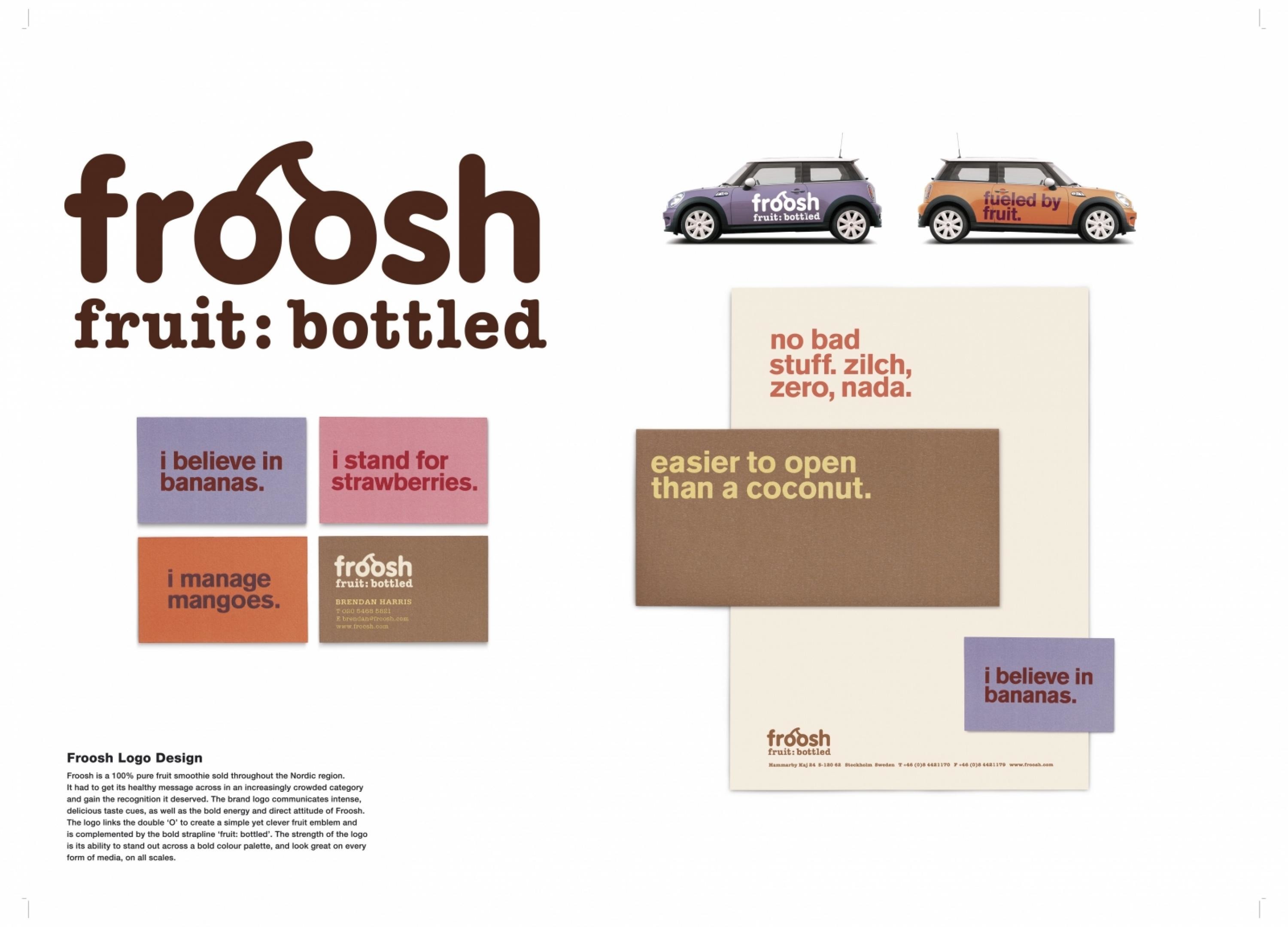
The branding communicates intense, delicious taste cues, as well as the bold energy and direct attitude of Froosh. The logo links the double ‘O’ to create a simple yet clever fruit emblem and is complemented by the bold strapline ‘fruit: bottled’ that brings the purity of the product to life. The strength of the logo is its ability to stand out across a bold colour palette, and to look great on every form of propriety media, on all scales. It also acts as a marque of authority - a strong signature stamp that signs off each statement on pack.
More Entries from Logo Design in Design
24 items
More Entries from PEARLFISHER
24 items

