Design > Packaging Design
JME HOMEWARE
PEARLFISHER, London / JAMIE OLIVER / 2009
Overview
Credits
OVERVIEW
BriefExplanation
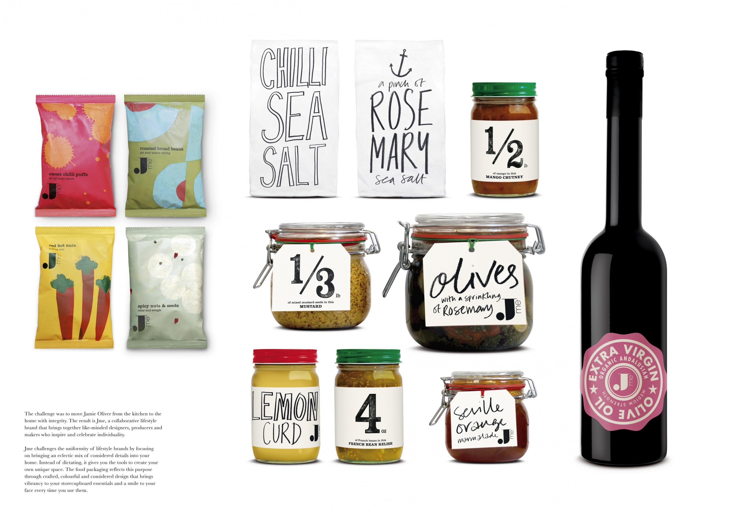
Jme is a new collaborative lifestyle concept originating from Jamie Oliver. It is a distinct, stand-alone brand that moves from the kitchen into the wider home, retaining the celebrated chef’s clear beliefs and values but focusing on ideas from a collective of like-minded lifestyle experts rather than Jamie alone.
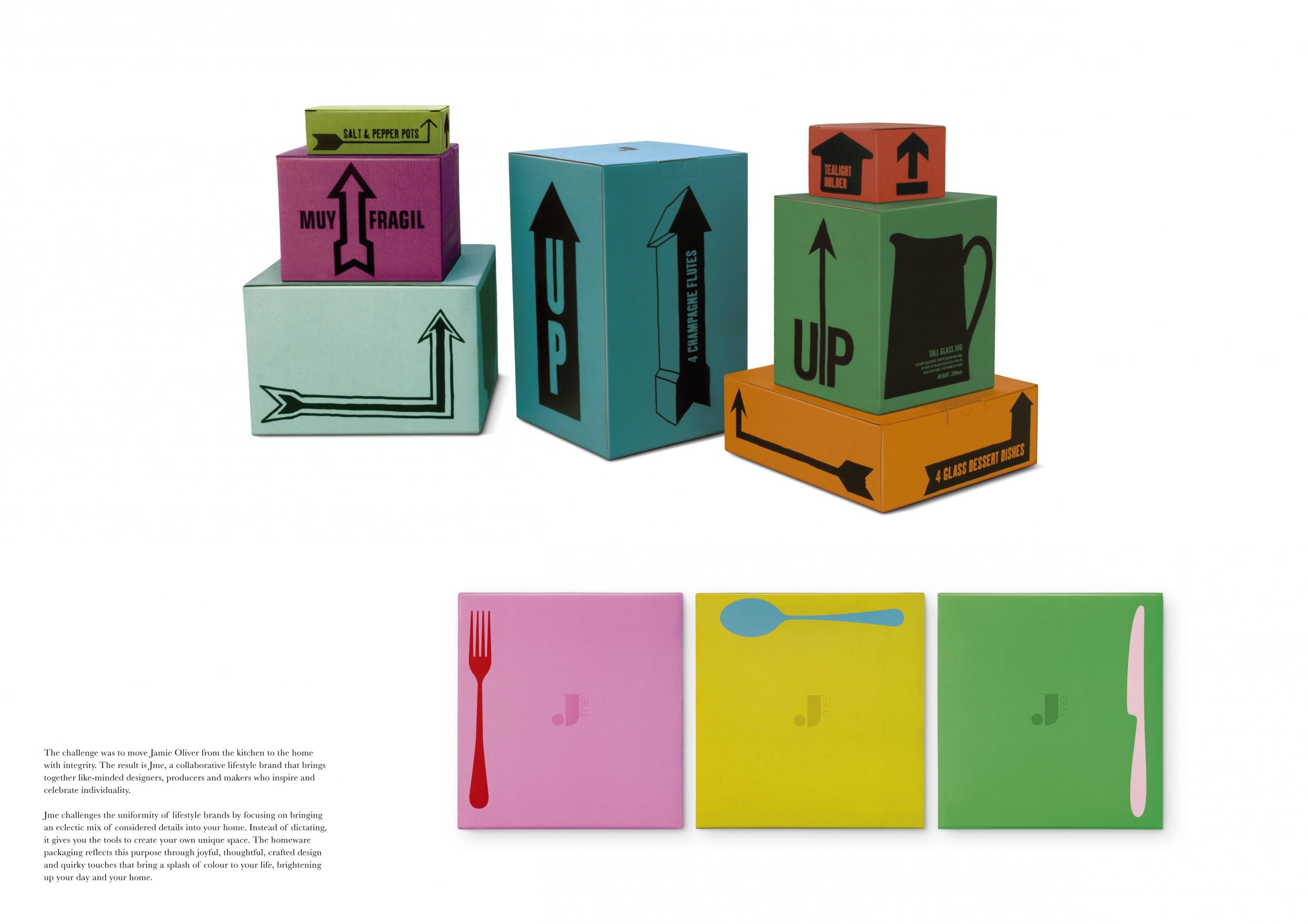
The brief was to create a strong logo and visual identity for Jme and develop an inspiring packaging solution for the growing range, including 150 homeware SKUs. Each product required a unique, eclectic, interesting and practical packaging solution that engaged consumers and brightened up their day with little considered touches.
ClientBriefOrObjective
Jme brings together experienced designers, producers and growers into its collaborative brand. Therefore, the brand identity and packaging has to reflect this eclectic mix of expertise.In order to succeed as a lifestyle brand, it is crucial Jme moves seamlessly from the kitchen – where Jamie Oliver’s expertise lies – into the wider home with packaging that reflects the integrity of the collaborative approach.
To differentiate this collection from other lifestyle brands, we created inspiring segmentation, focusing on the mix of products and how they come together differently in each individual home – the packaging had to imaginatively navigate these four segments.
Effectiveness
Jme launched online in December 2008 and since then it has received an average of 22,000 unique visitors a week. There was only minimal PR and no advertising spend on launch so traffic has come via the Jamie Oliver website and word of mouth.
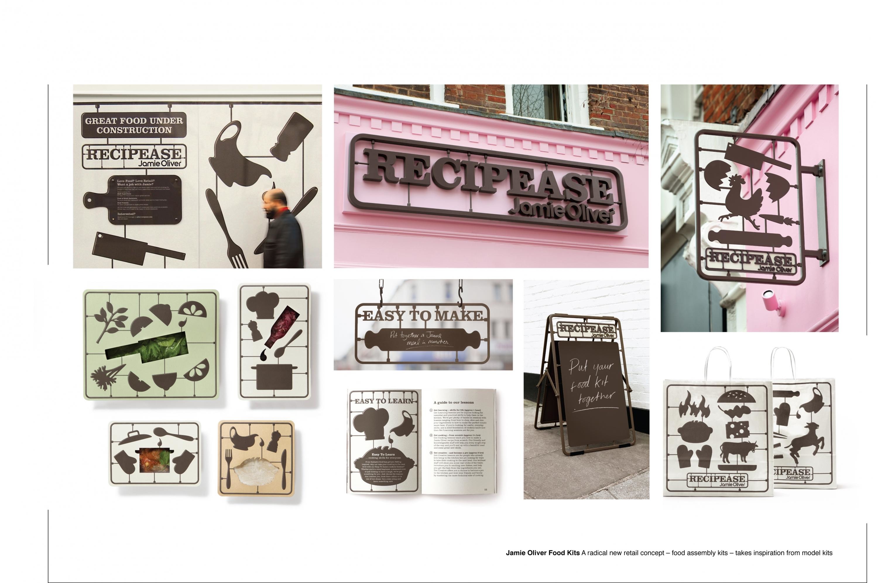
When Jme launched in a dedicated London retail space alongside Jamie Oliver's cookery class concept, Recipease, it outperformed predicted sales by 100%, being responsible for 40% of the shop's revenue in its first two weeks.
Despite Jamie Oliver being associated with food, Jme homewares and the high-price lifestyle items have sold just as readily as food.
Execution
The distinctive logo is considered and adaptable, allowing the Jme brand to exist naturally in a multitude of ways.The packaging is fresh, striking, and reflects the specific function of each product it contains, using the bold Jme logo to hold the collection together. It also uses the most imaginative and environmentally responsible packaging solutions available.The Gather & Share segmentation focuses on relaxed entertaining and shared experiences. For homeware packaging, this is translated as beautiful, generous designs that use joyful colours, witty words and quirky illustrations to make staying in a delight and cooking for friends a true pleasure.
More Entries from Homewares, Home Appliances & Automotive in Design
24 items
More Entries from PEARLFISHER
24 items
