Design > Packaging Design
CAWSTON PRESS
PEARLFISHER, London / CAWSTON PRESS / 2010
Overview
Credits
OVERVIEW
BriefExplanation
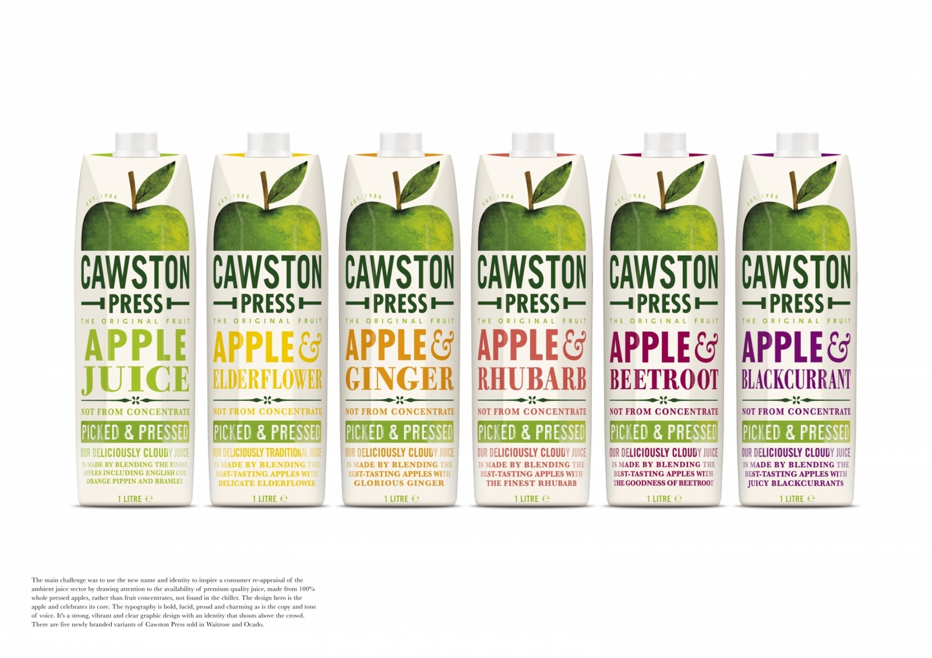
We were tasked with visibly capturing and preserving the flavour and essence of the apple, to create a stand out design that visibly connects the consumer with the fruit and qualities attributed to the natural juice produced by Cawston Press.
ClientBriefOrObjective
The main challenge was to use the new name and identity to inspire a consumer re-appraisal of the ambient juice sector by drawing attention to the availability of premium quality juice, made from 100% whole pressed apples rather than fruit concentrates, not found in the chiller. It also aimed to reinvigorate the ambient aisle itself, introducing premium branded innovation to an area generally perceived as generic and standardised and with no named brands.
Effectiveness
There are five newly branded variants of Cawston Press (Apple, Apple & Ginger, Apple and Elderflower, Apple and Rhubarb and Apple and Blackcurrant) sold in Waitrose and Ocado.
Execution
The final design heroes the humble apple and celebrates its very appleness. The typography is bold, lucid, proud and charming as is the copy and tone of voice. It's a strong, vibrant and clear graphic design with an identity that shouts above the crowd - speaking directly to consumers as well as creating a strong dynamic shelf presence to bring some much needed news to the neglected ambient fixture.
More Entries from Non-Alcoholic Drinks in Design
24 items
More Entries from PEARLFISHER
24 items
