Design > Packaging Design
WAITROSE LOVE LIFE
PEARLFISHER, London / WAITROSE / 2012
Overview
Credits
OVERVIEW
BriefExplanation
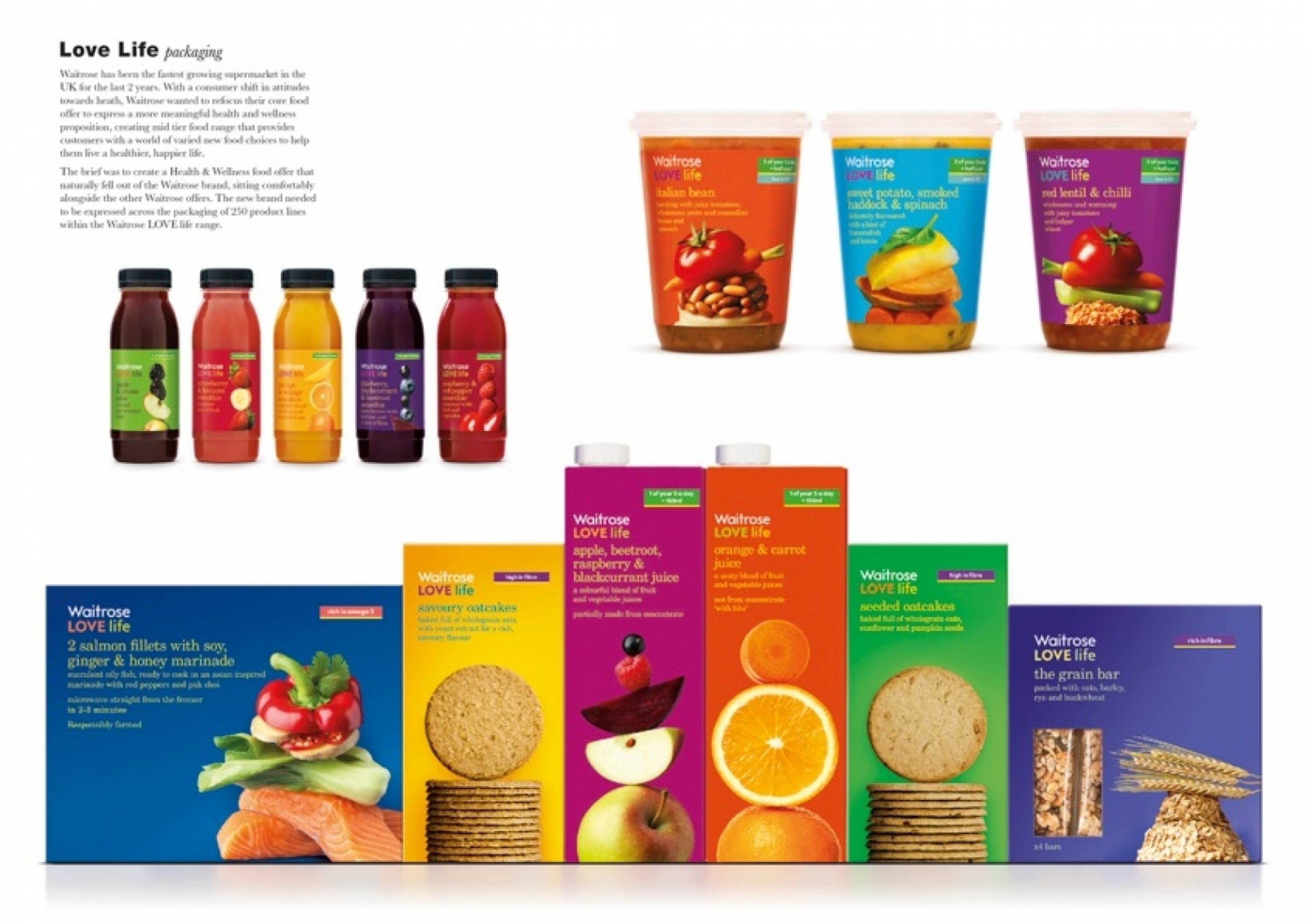
Waitrose has been the fastest growing supermarket in the UK for the last 2 years. With a consumer shift in attitudes towards health, Waitrose wanted to refocus their core food offer to express a more meaningful health and wellness proposition, creating mid-tier food range that provides customers with a world of varied new food choices to help them live a healthier, happier life.
The brief was to create a Health & Wellness food offer that naturally fell out of the Waitrose brand, sitting comfortably alongside the other Waitrose offers. The new brand needed to be expressed across the packaging of 250 product lines within the Waitrose LOVE life range.
ClientBriefOrObjective
The health and wellness brand offer had to reflect and build on Waitrose’s uniqueness, but be explicit with the freshness, naturalness and positivity it represents. We used future insight to explore the existing world of health in food. Until now, healthy food brands have been prescriptive and, or restrictive. In addition, food commercialisation has distanced us from our natural instincts of what is good to eat. We needed to capture the pleasure of food and essence of health, coming together to create the ideal good life.
Effectiveness
In the 52 weeks since launch, Waitrose LOVE life has achieved astronomical success. The brand design is stated as being at the heart of this and the key factor that customers liked.
The total brand is forecast to achieve sales of £80m in 52 weeks from launch.
•Key Facts-Like for like, sales on ambient products were up 13% YOY(figures to Jan 2012)-In the last 12 weeks data (ending 17.03.12) total healthy own label market grew by +4% whilst Waitrose grew by 34.7%-Waitrose outperformed the market in chilled, Bakery, Grocery, meat fish and poultry, and frozen•Key facts-21% of our customer base bought a LOVE life product in February 2012-Close to 50% of our primary shopper base have heard about or bought into the brand-Awareness of the LOVE life brand continues to grow
Execution
We established a unique Waitrose philosophy for the new brand offer and expressed it across the packaging design. To view health and wellbeing as taking us from restricted living to a liberating lifestyle. We wanted to celebrate health and wellbeing, turning it from a negative to a positive. Our universal brand essence was ‘coming to life’ and the design essence was ‘Natural Vibrancy’.
The identity, name and packaging design celebrates positivity and the benefits of healthy eating. The design uses a vibrant colour palette associated with positivity and naturalness. Food photography was created to show how the variety of ingredients come together to create appetising, tasty and healthy choices.
More Entries from i. Own Label and Private Label brands in Design
24 items
More Entries from PEARLFISHER
24 items

