Design > Corporate or Brand Identity
ÜBERSHOT
PEARLFISHER, London / UBERDRINKS / 2010
Overview
Credits
OVERVIEW
BriefExplanation
The brief was to create an identity, packaging and SRP (shelf ready packaging) for a new energy shot that would be launched in the UK with potential to roll-out across Europe.Energy shots are a huge market in the US, but are relatively unknown in the UK, so the brief included introducing this format to a new audience.The identity had to demonstrate its status as a highly effective product and express its ‘no crash’ message clearly in a way that would win the loyalty of the urban professional.
ClientBriefOrObjective
Übershot wanted to challenge the stigmas surrounding energy drinks by creating a sophisticated, highly effective and super stylish product. The objective was to create a whole new category language. Übershot wanted to offer a stylish accessory that trendsetters would be excited to talk about and purchase.Übershot would be competing with established global players with big communications budgets, launching around the same time in the UK, so as a start-up brand on a small budget a key objective was to ensure that the identity and packaging worked hard to communicate the Übershot message with no advertising support.
Effectiveness
Launched online and exclusively in London’s Harvey Nichols Food Hall, these are early days for this start-up brand, but so far so good. To be the only energy shot listed by one of London’s most prestigious fashion stores shows that its sleek looks are approved of by the style crowd, helping Übershot to stand out from its competitors in these crucial first months.
Execution
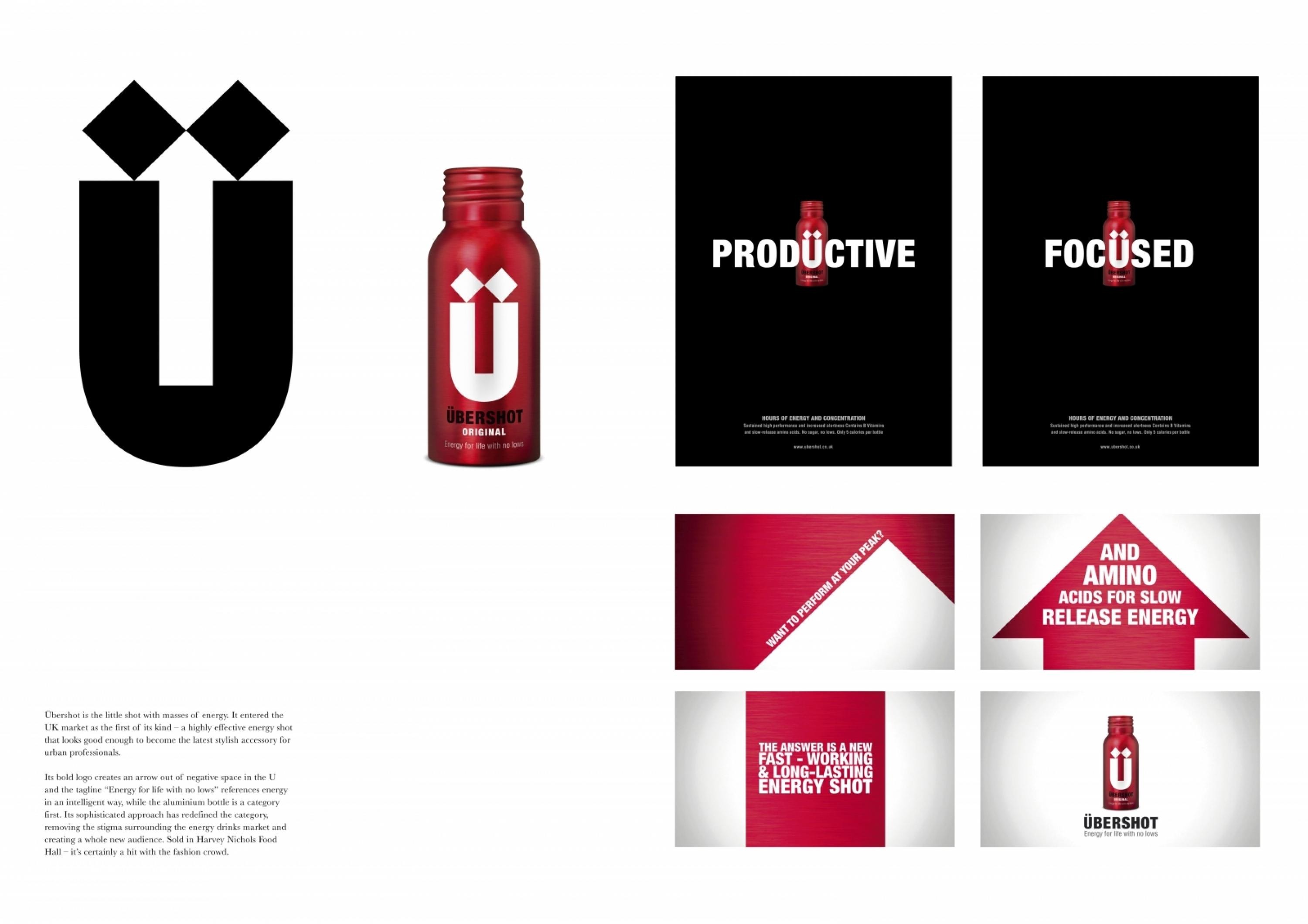
The sleek, smart identity makes this an accessory that people are proud to be seen with: the Ü logo is strong and striking with an arrow created out of the negative space - it is an icon in the making with great off-pack potential. Similarly, the aluminium packaging is a first in this category and creates instant standout next to the plastic bottles used by competitors.
The formula was developed to avoid the usual crash that comes when normal energy drinks wear off - hence the tag line devised - Energy for life with no lows.
More Entries from Small Scale Corporate Identity Schemes in Design
24 items
More Entries from PEARLFISHER
24 items
